Maruichi Rebranding
︎Branding, Typography
February 2023
︎Branding, Typography
February 2023
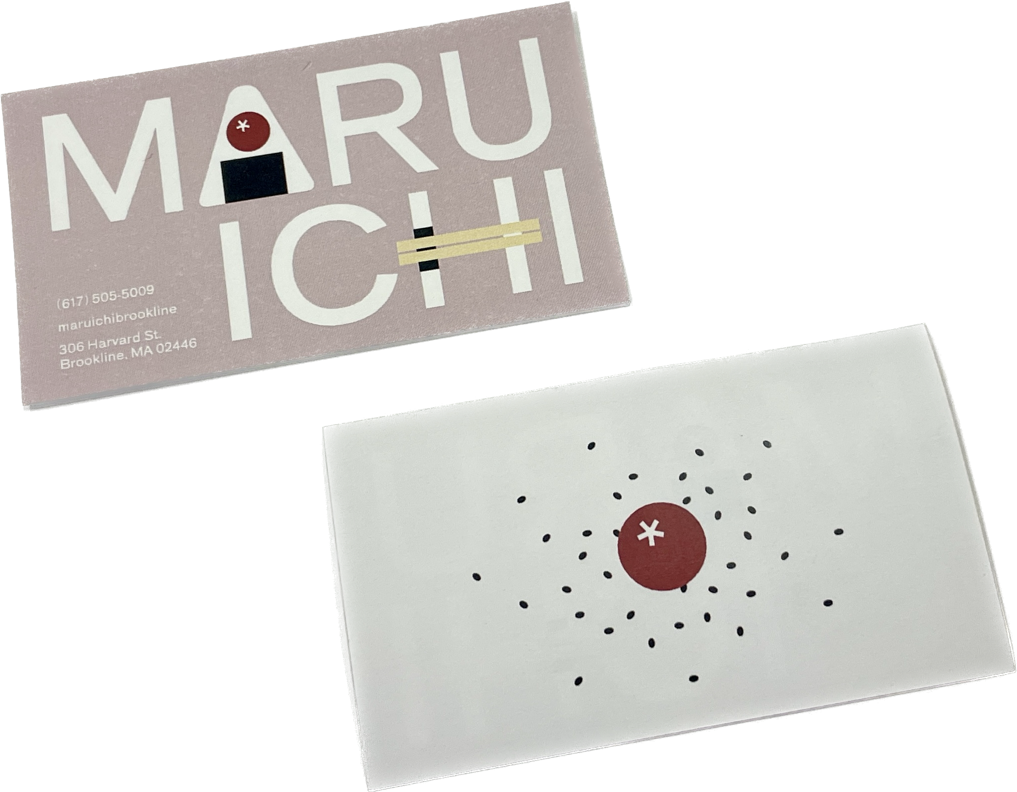
Business card (3.5” x 2”)
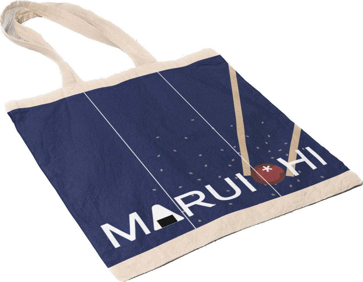
Tote bag (1000px x 1000px)
Researched, ideated, and rebranded a small local business, Maruichi, which is a Japanese grocery store. After doing an interview with the manager and doing site research, I produced a type-based rebrand that elevates their brand and helps them reach larger audiences. For instance, because the business originates from a small, family run business back in Japan and the store has a family friendly atmosphere, I tried to keep the warm and welcoming tone throughout while keeping the modern look that their current logo has. Maru (circle) and ichi (one in Japanese character) are combined to create the current logo, and I continue to emphasize that with the image of plum (which is usually included in Japanese rice balls and rice in bento boxes that are also sold at Maruichi) and horizontal chopsticks. I also brought in the store’s physical design by including the noren curtains in the tote bag design.