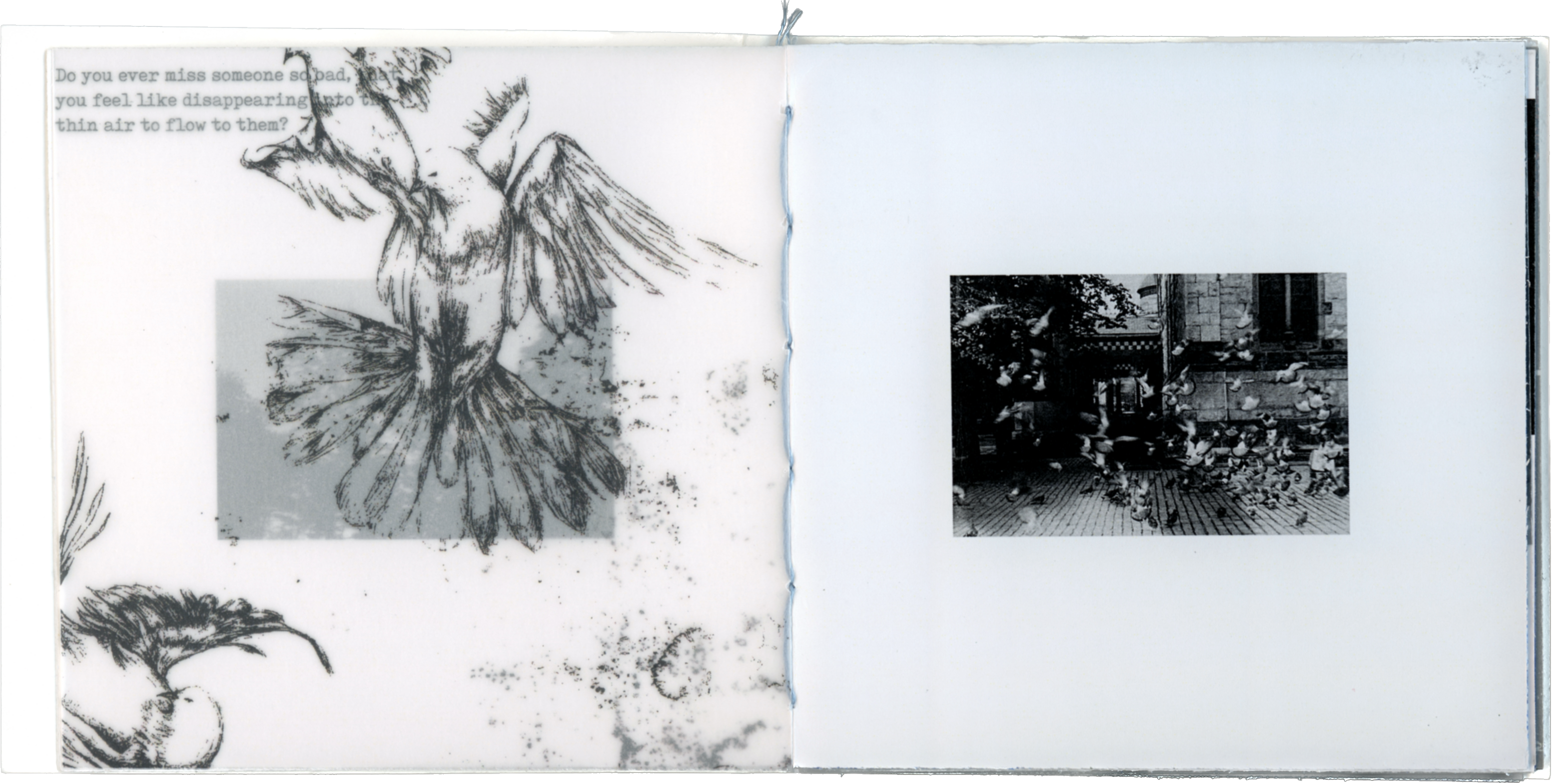
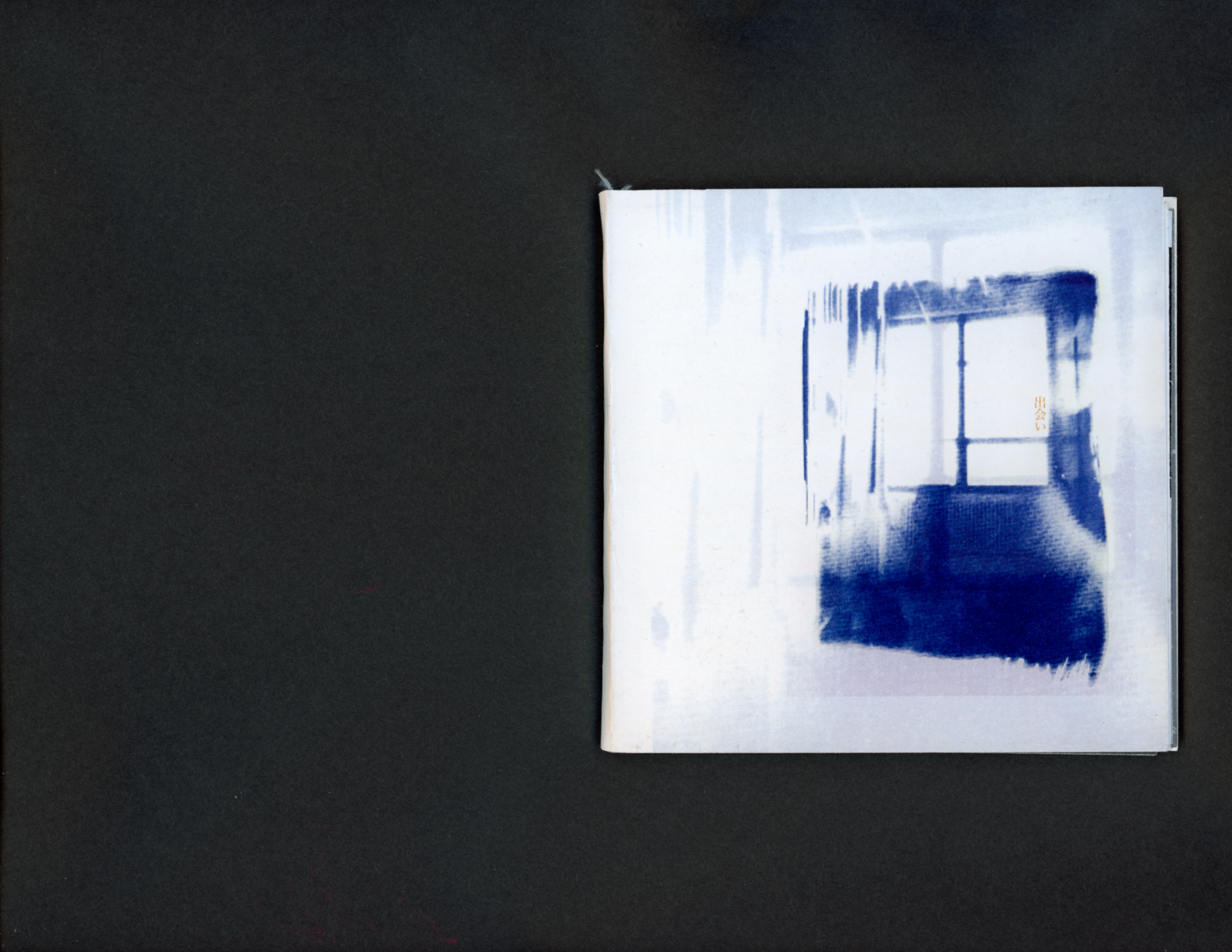
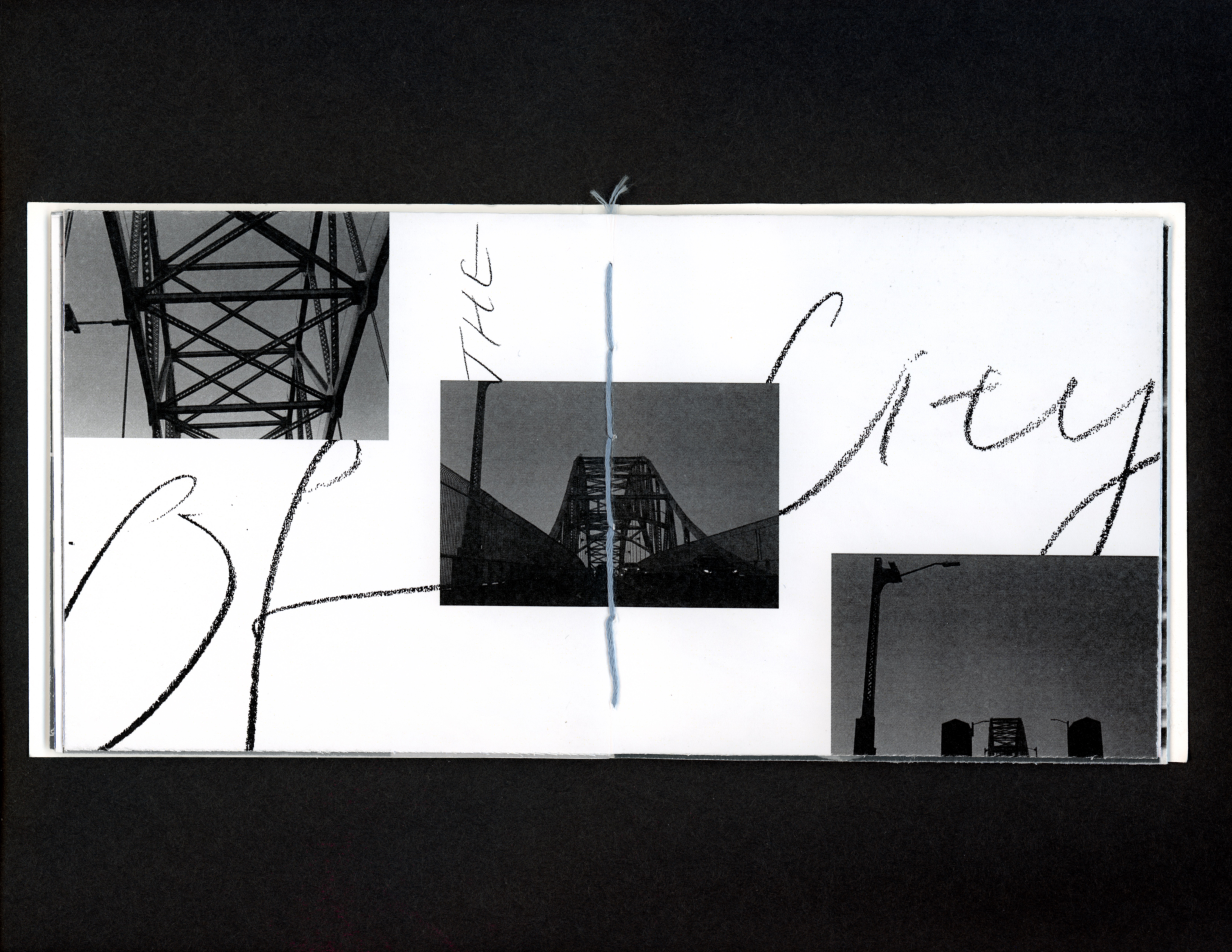
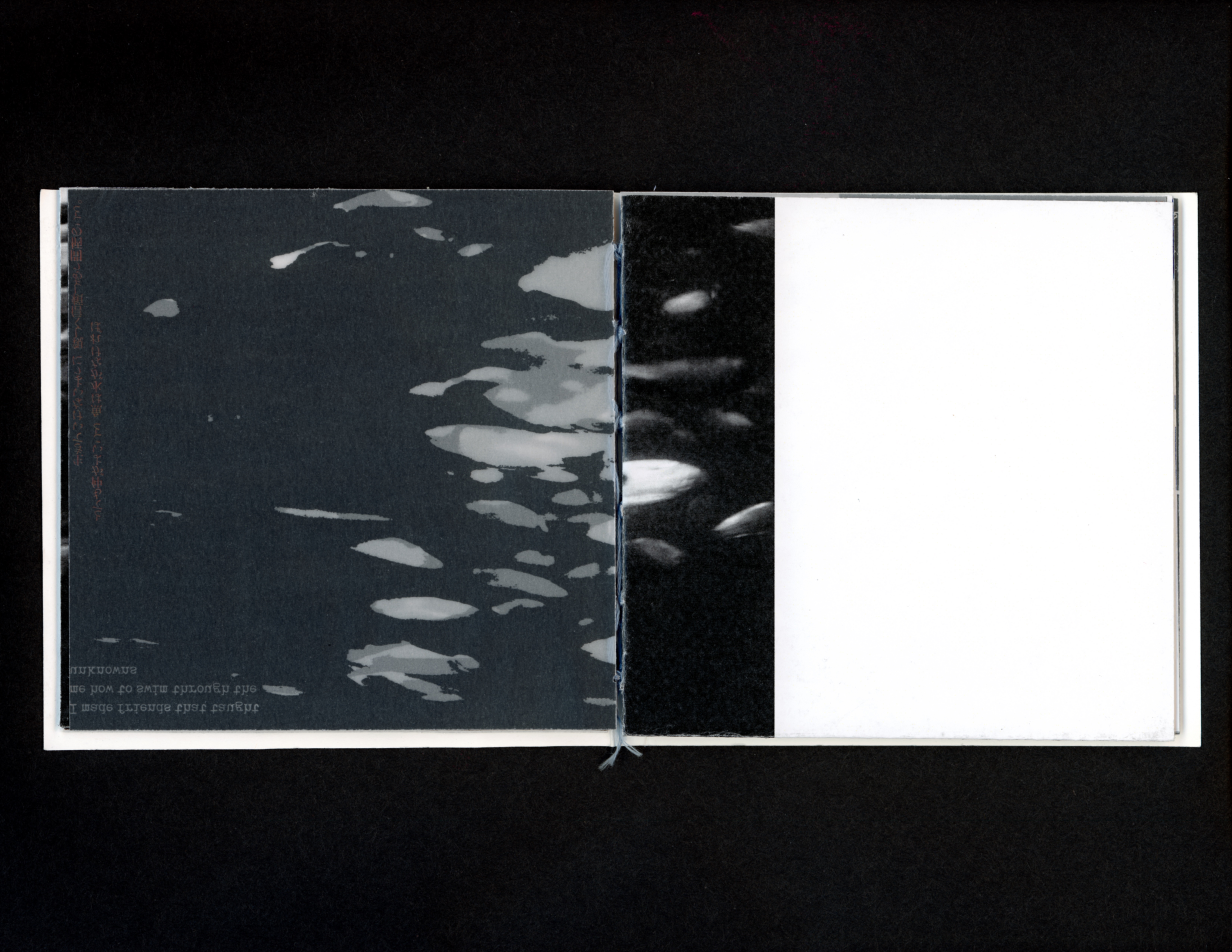
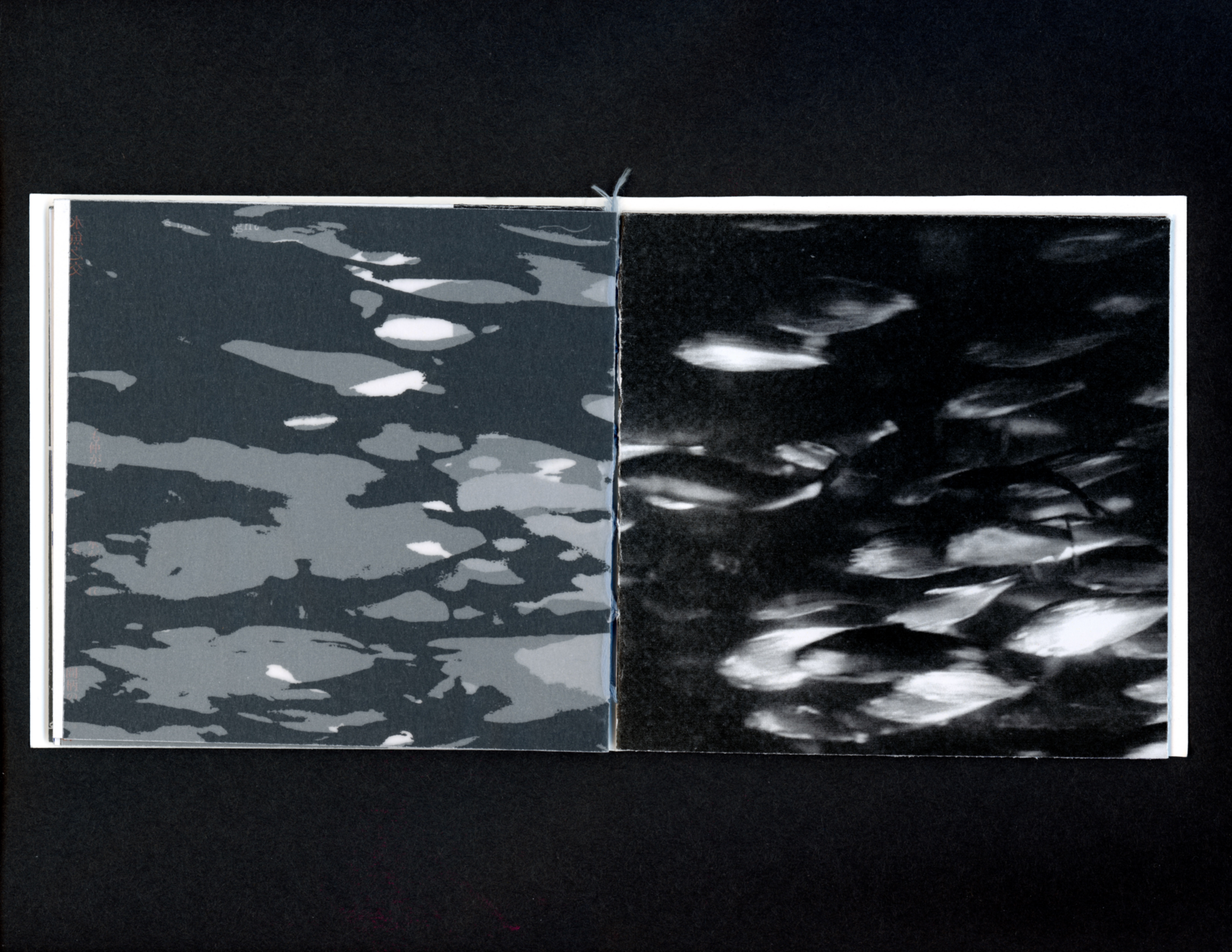
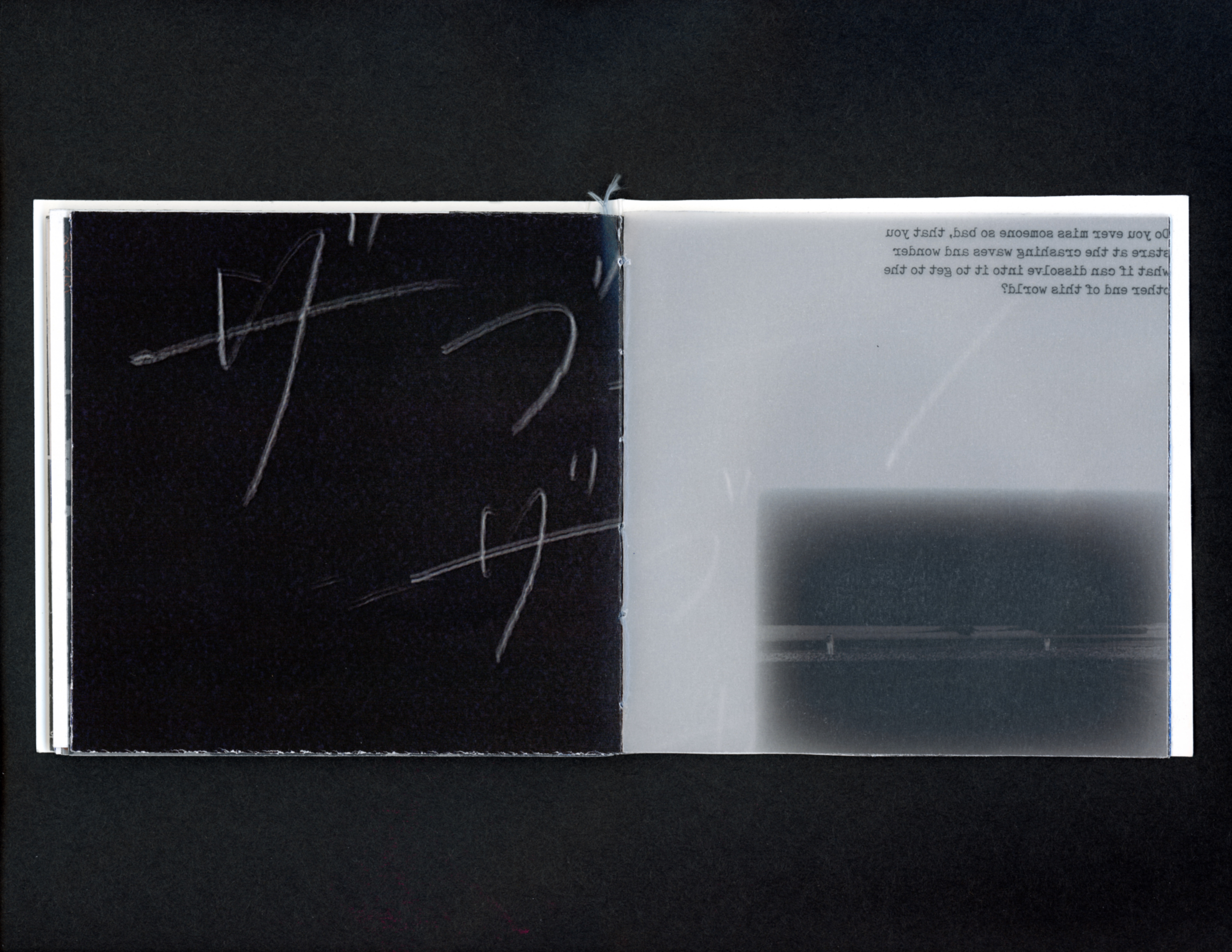
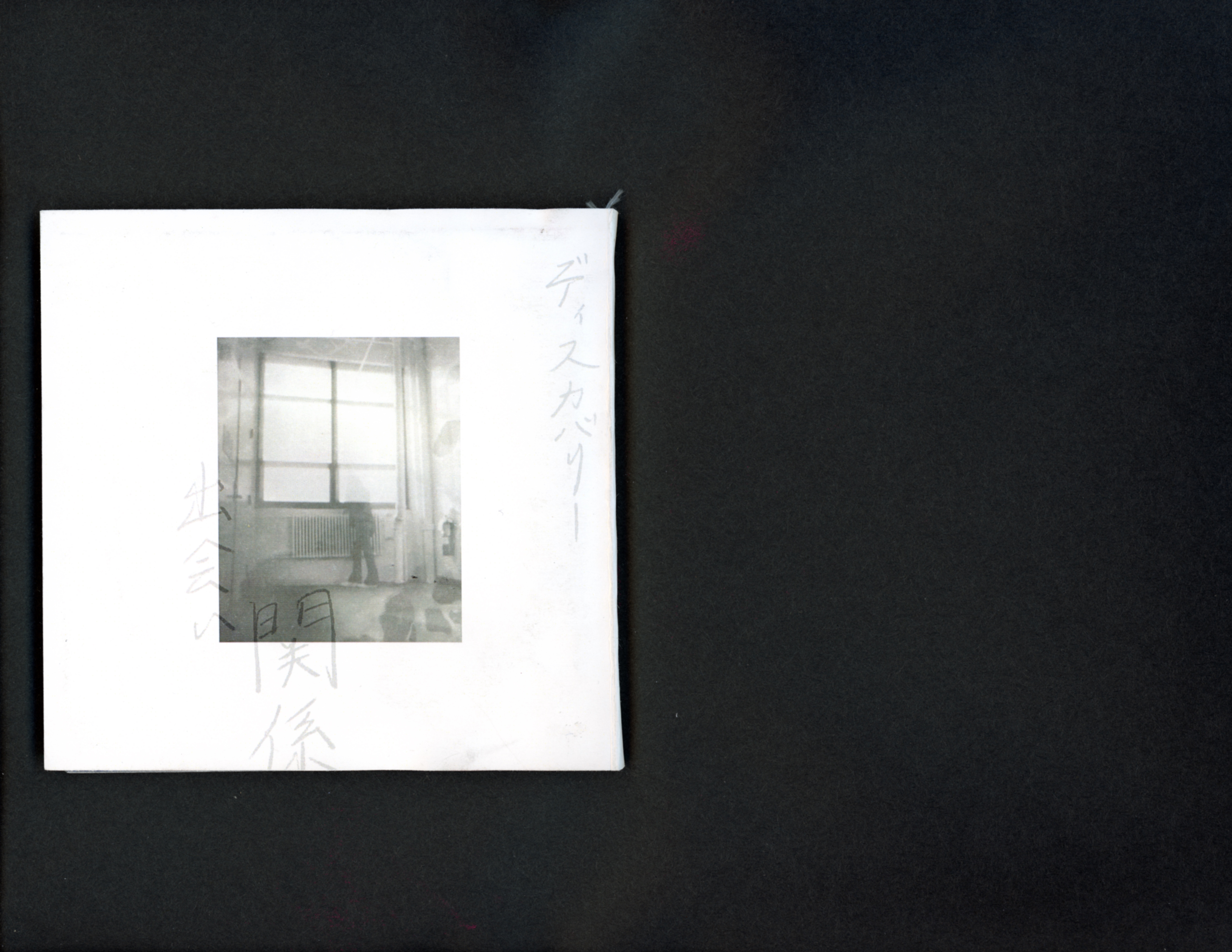
出会い (deai)
︎Editorial Design, Photography, Book Binding
5”x 5”
︎Editorial Design, Photography, Book Binding
5”x 5”
February 2023
Saddle-stitched
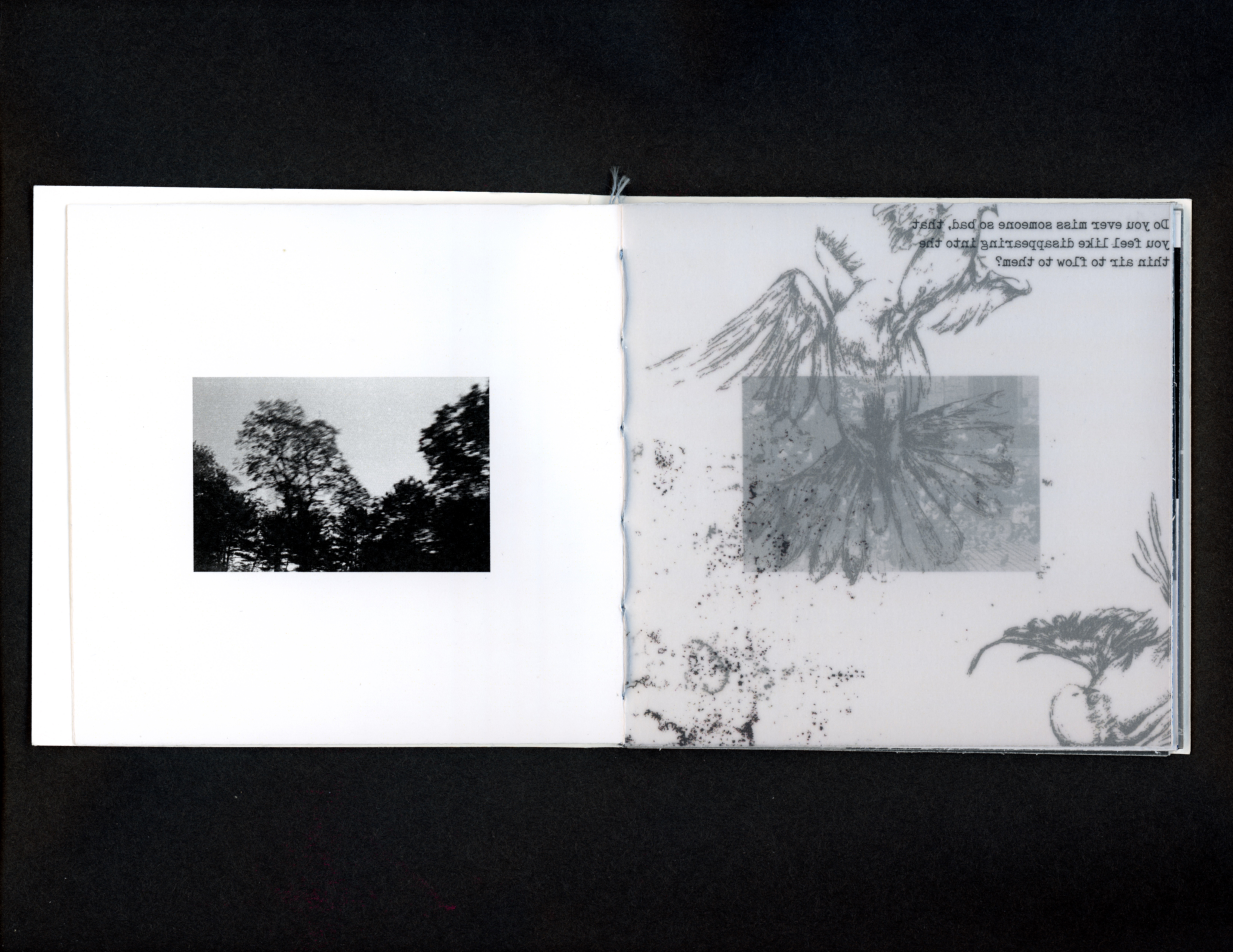
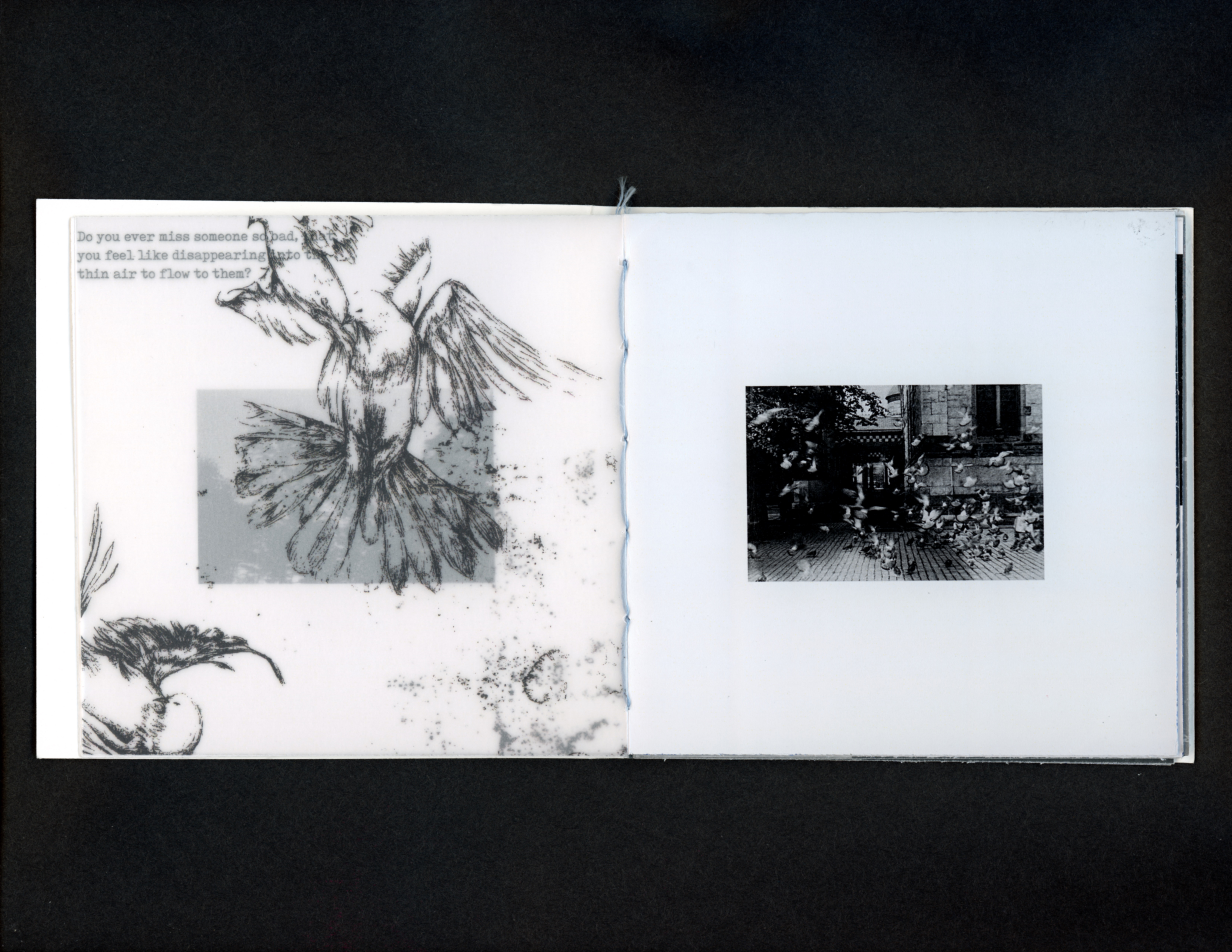
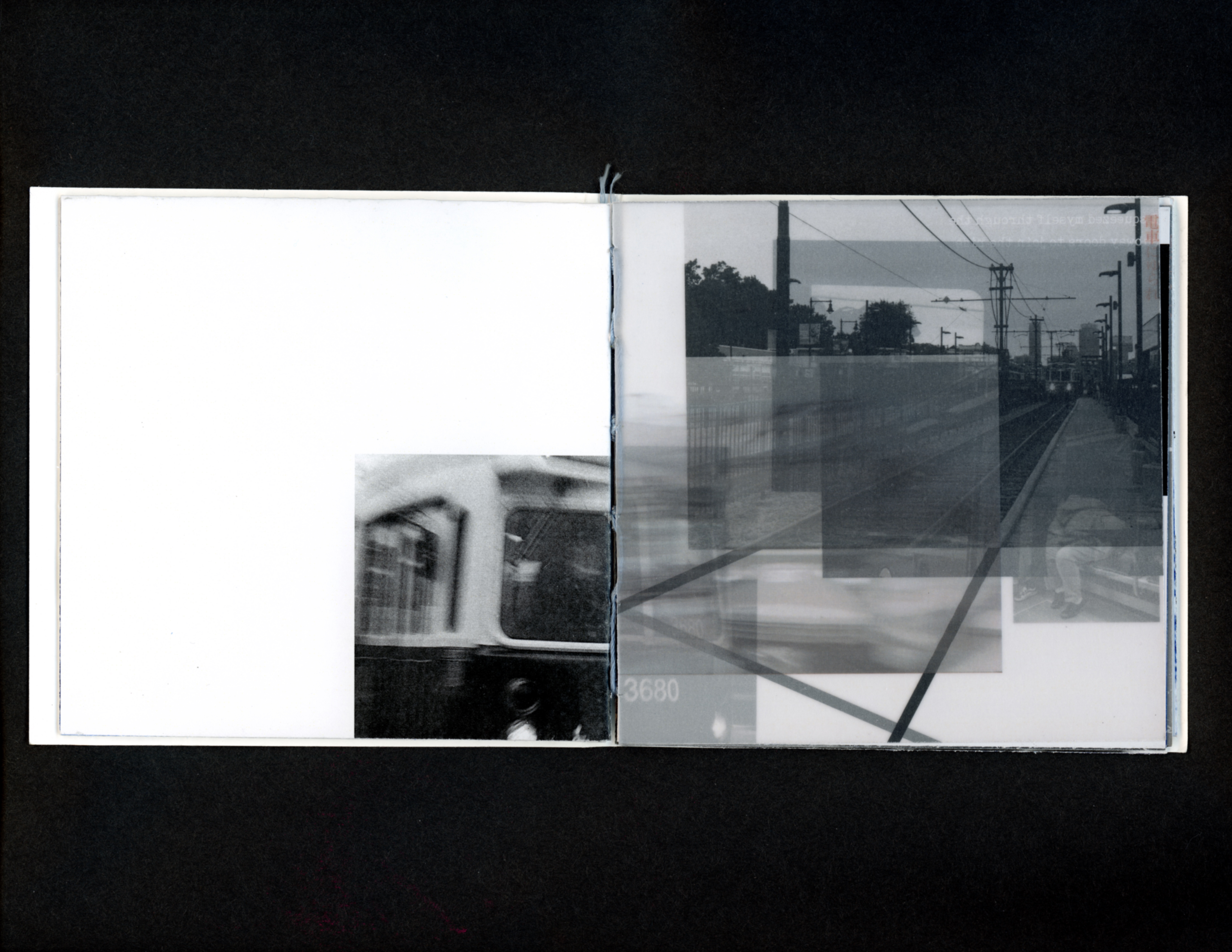
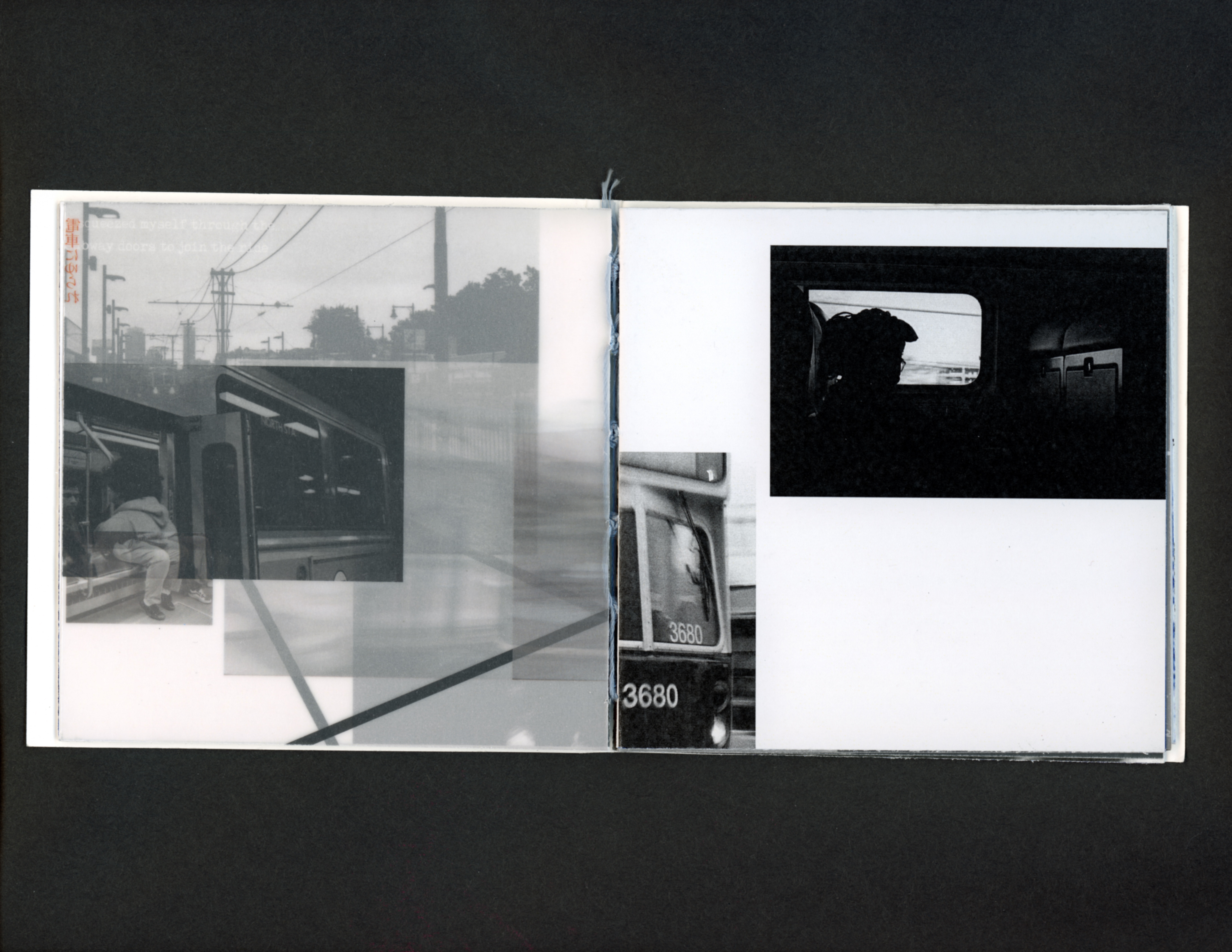
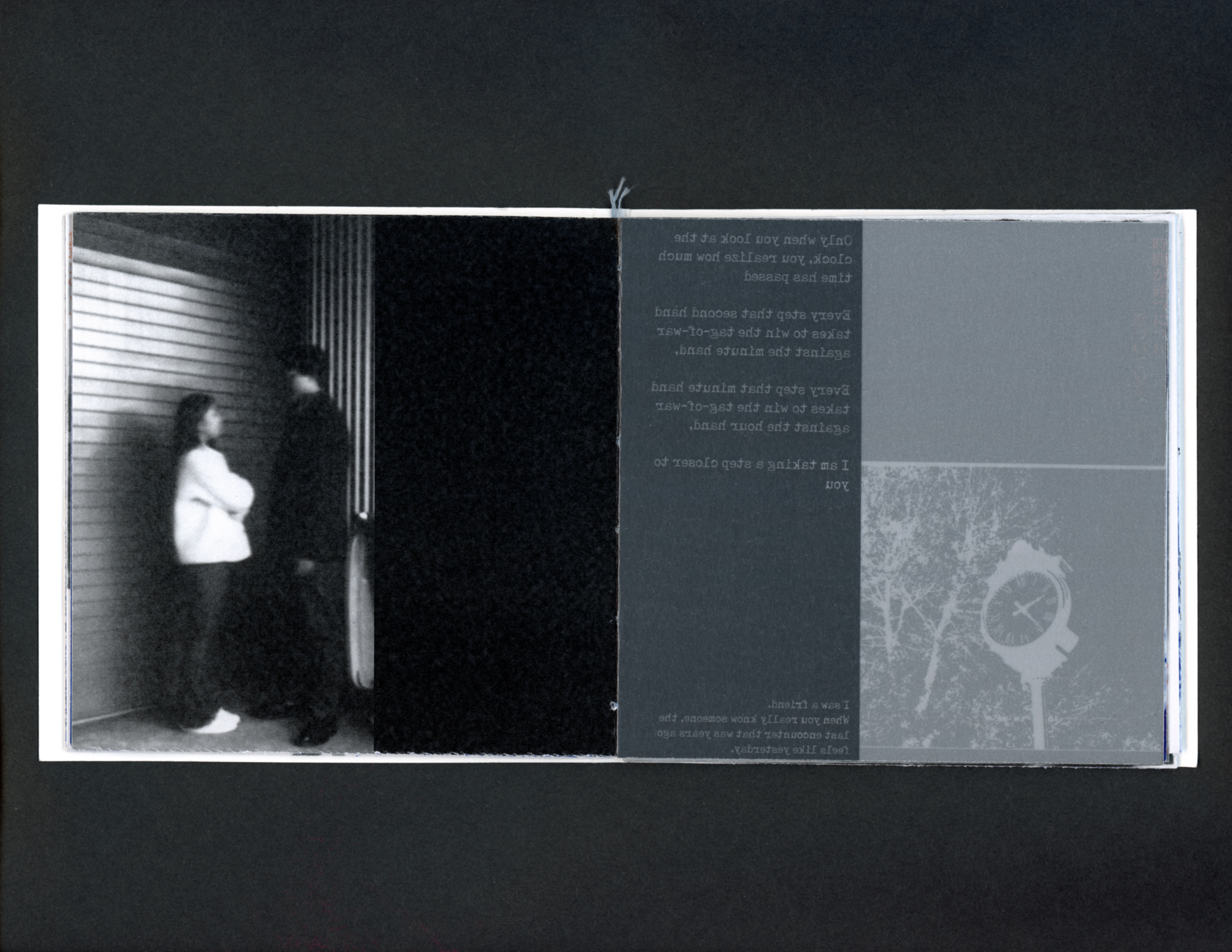
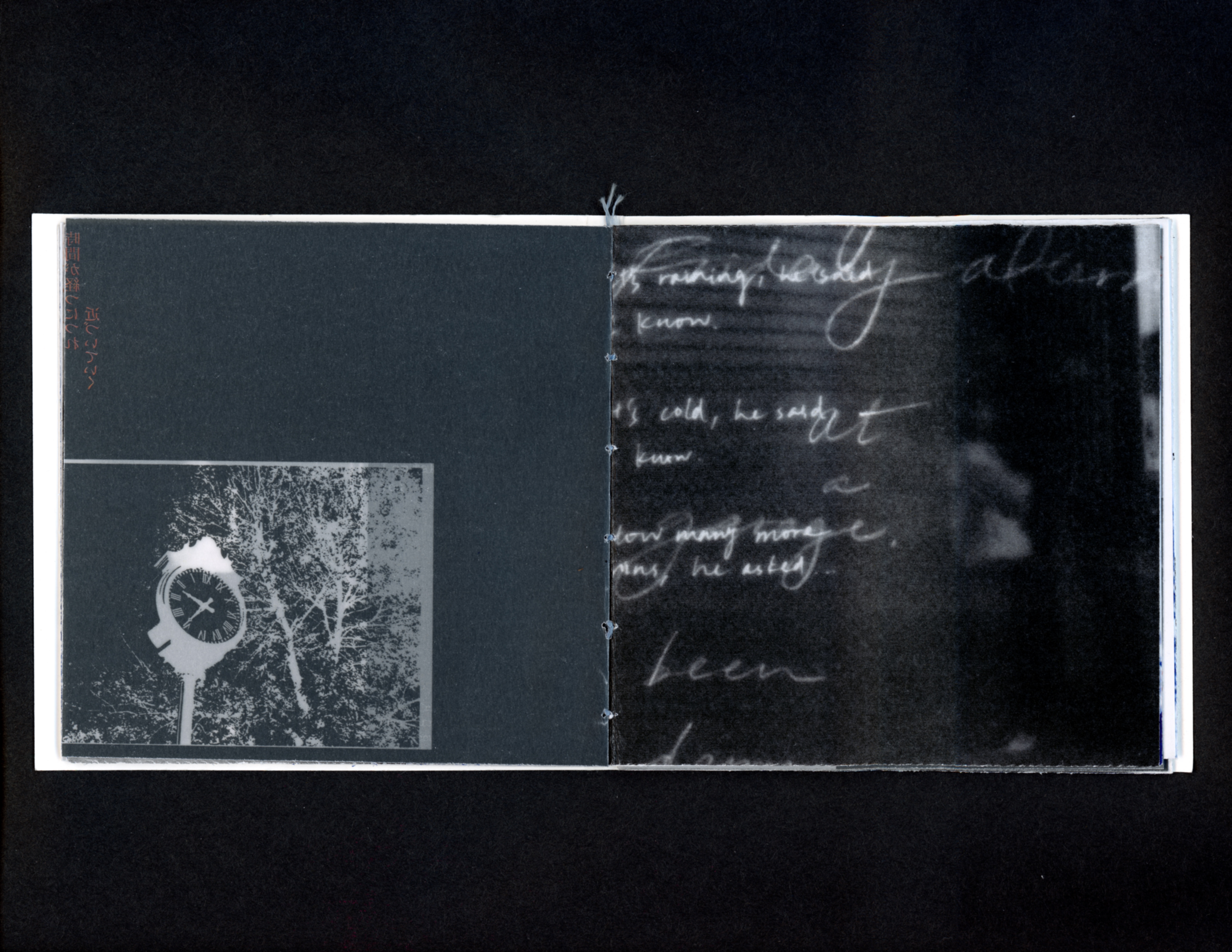
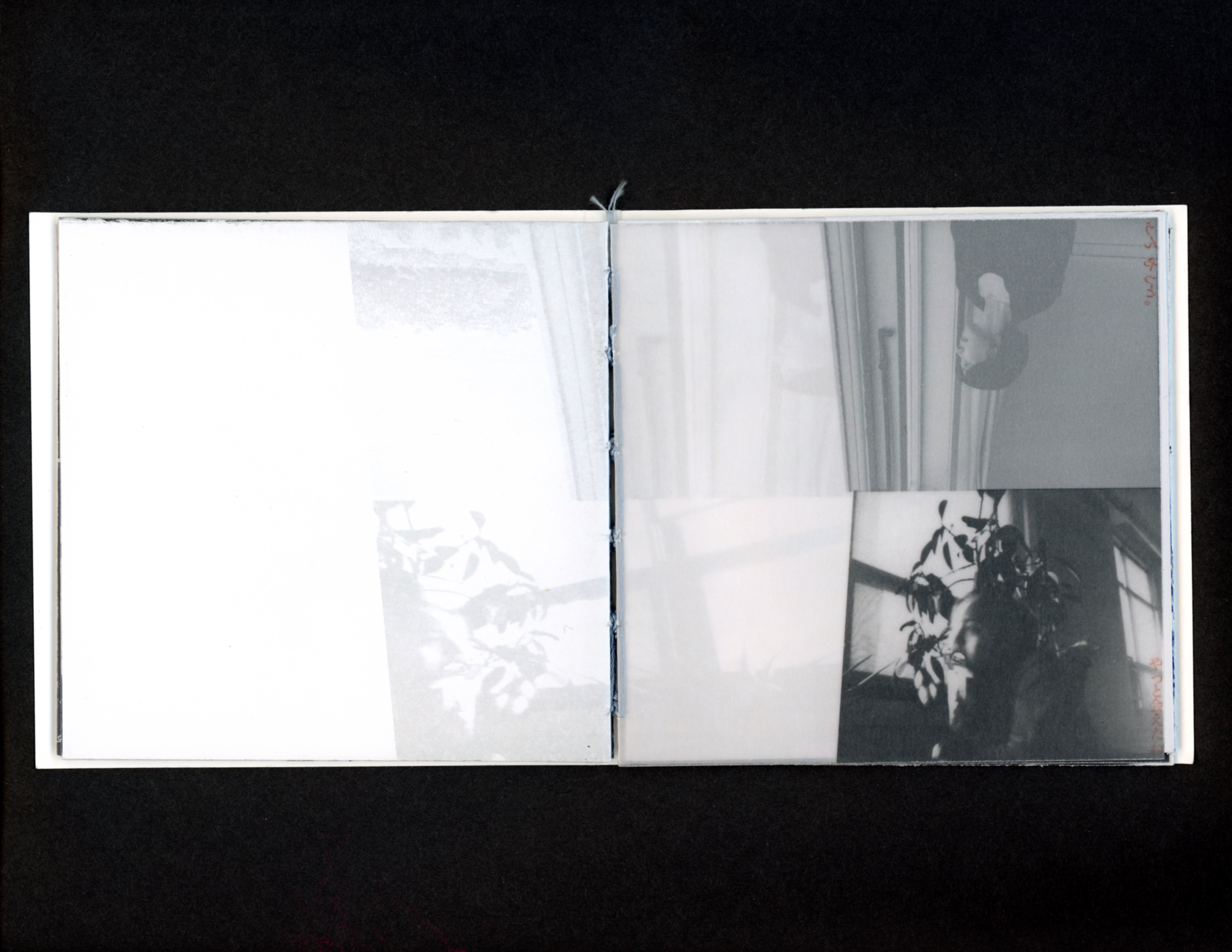
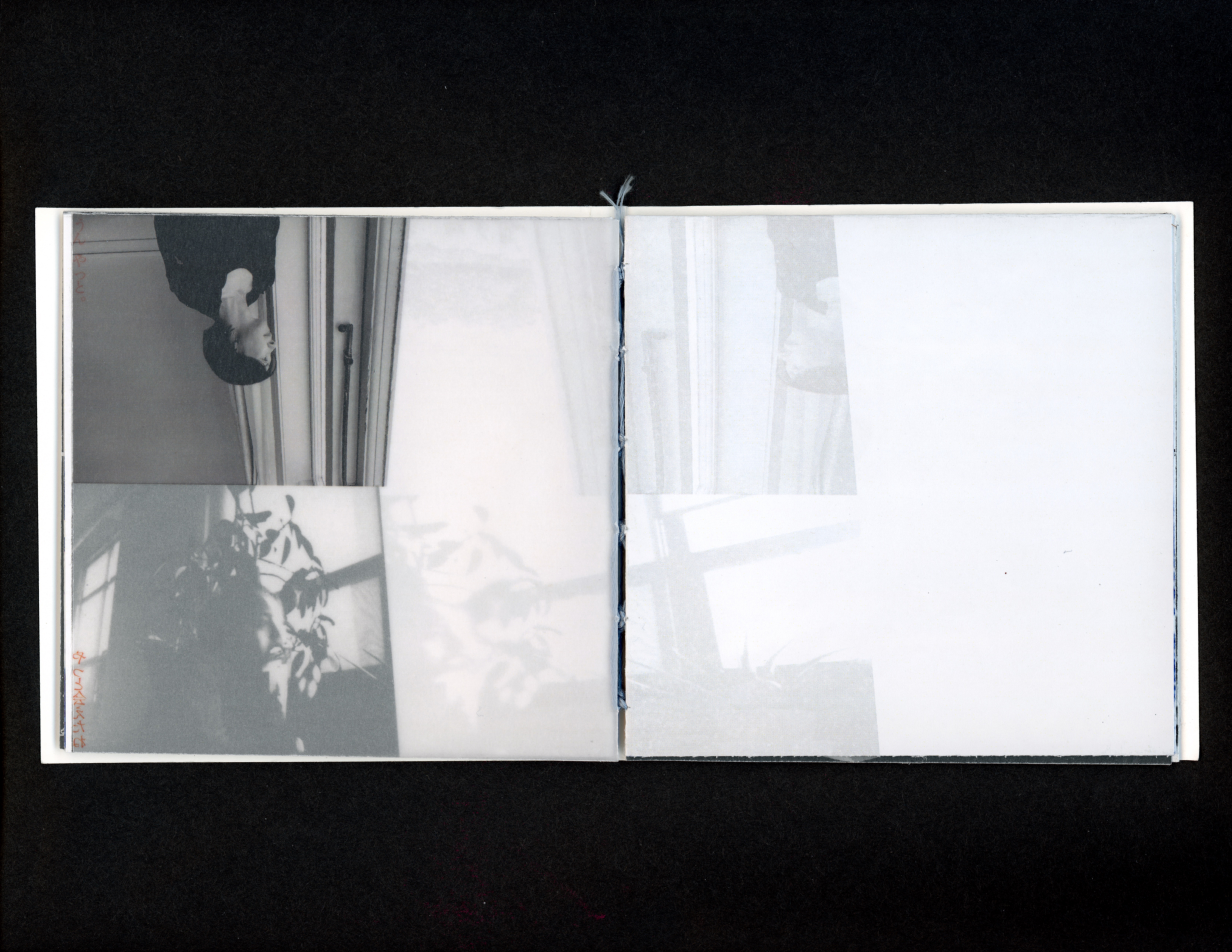
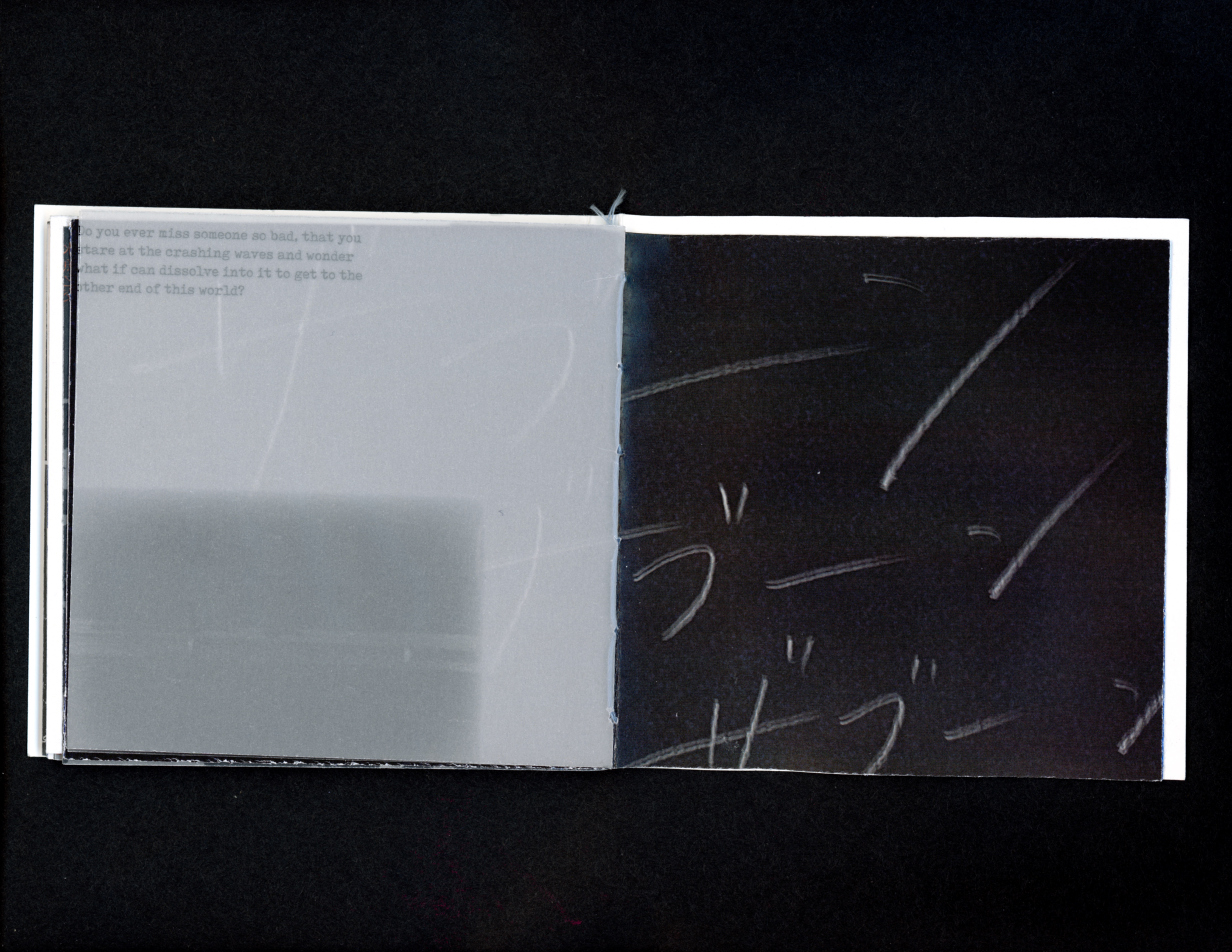
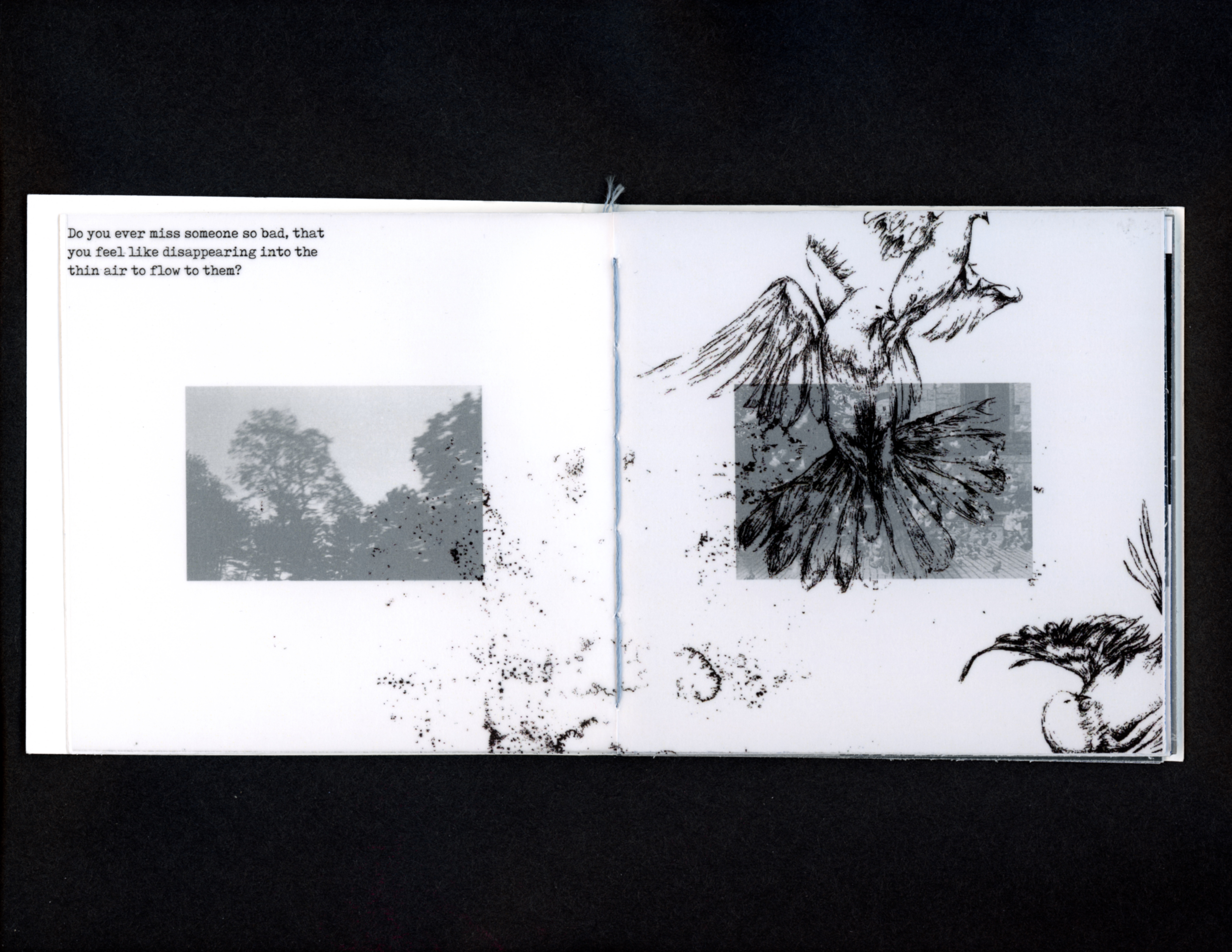
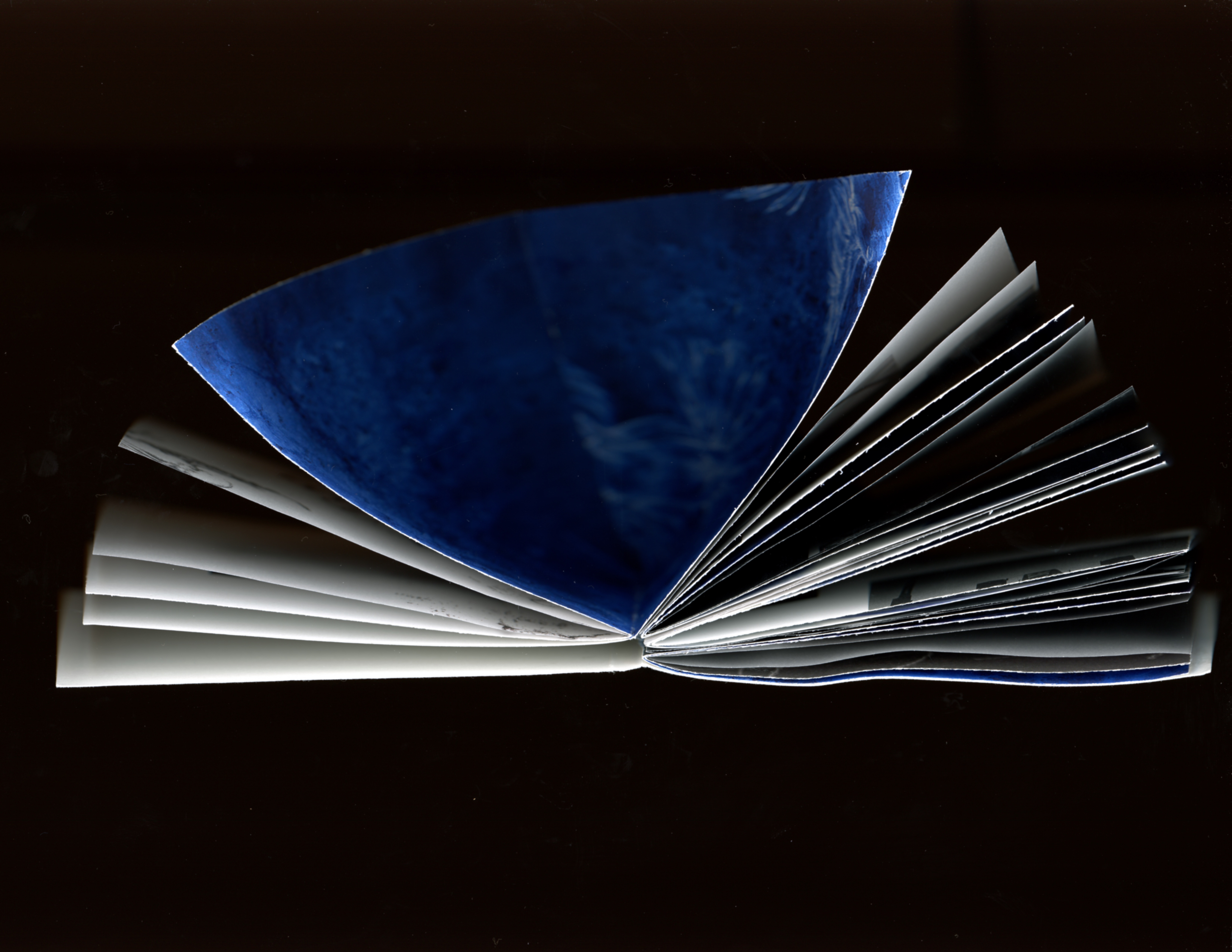
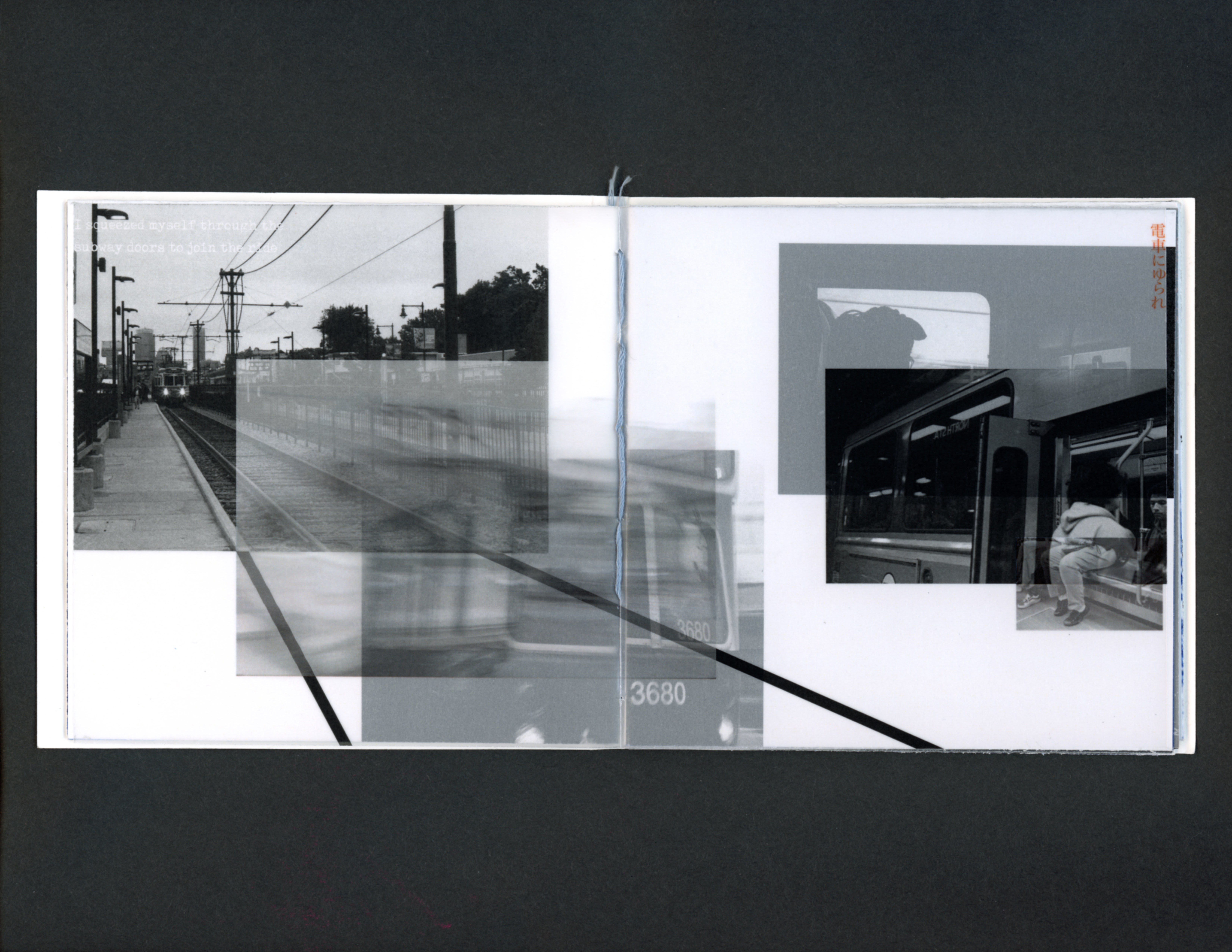
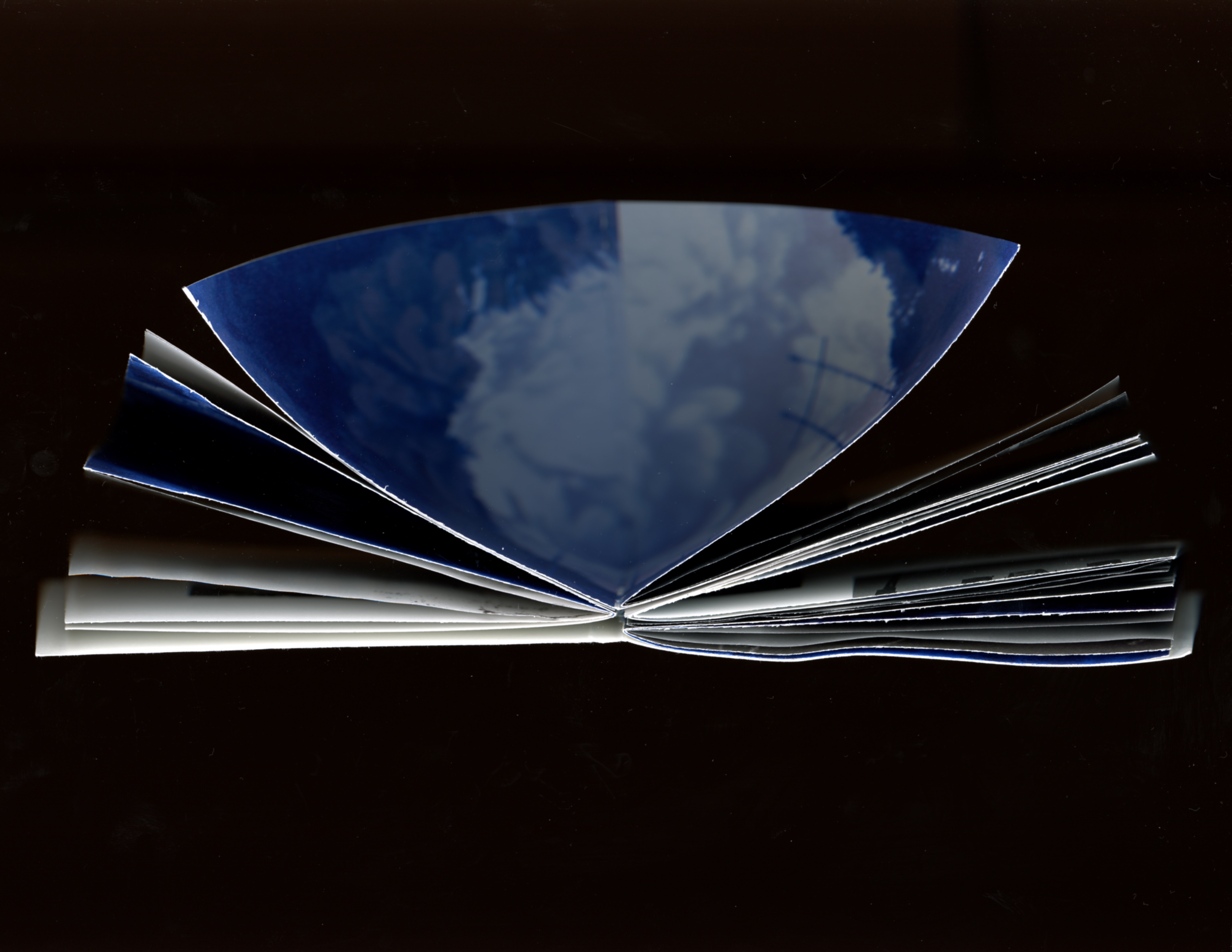
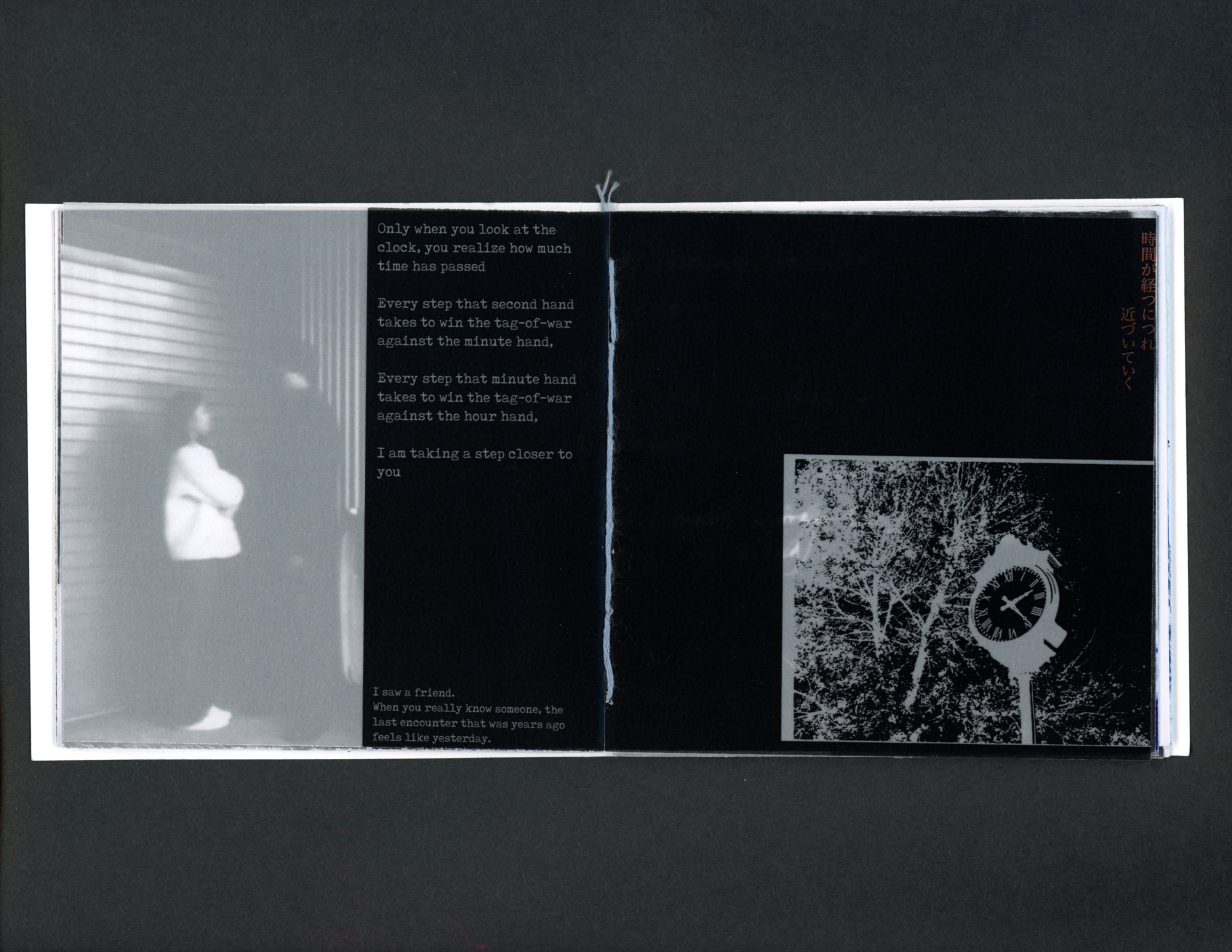
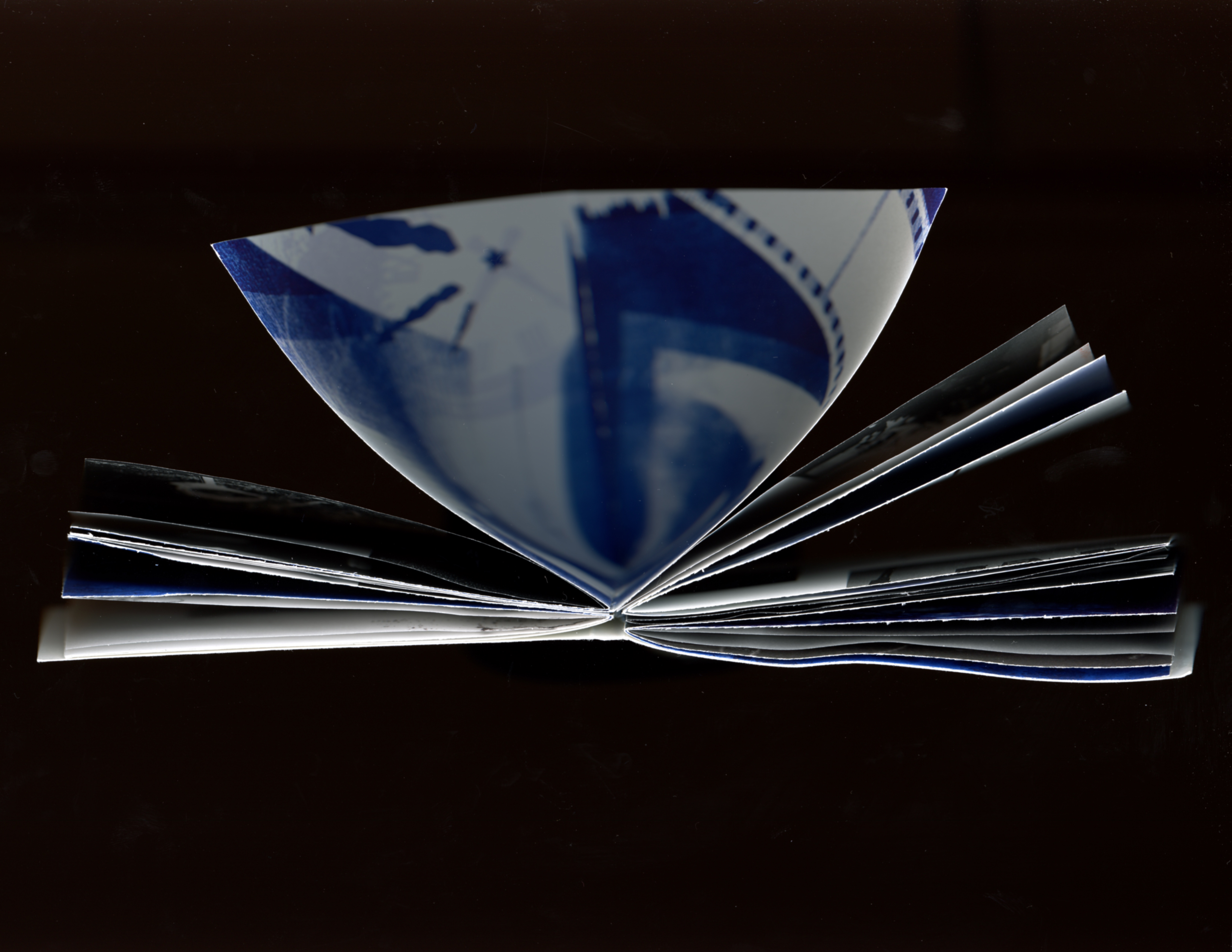
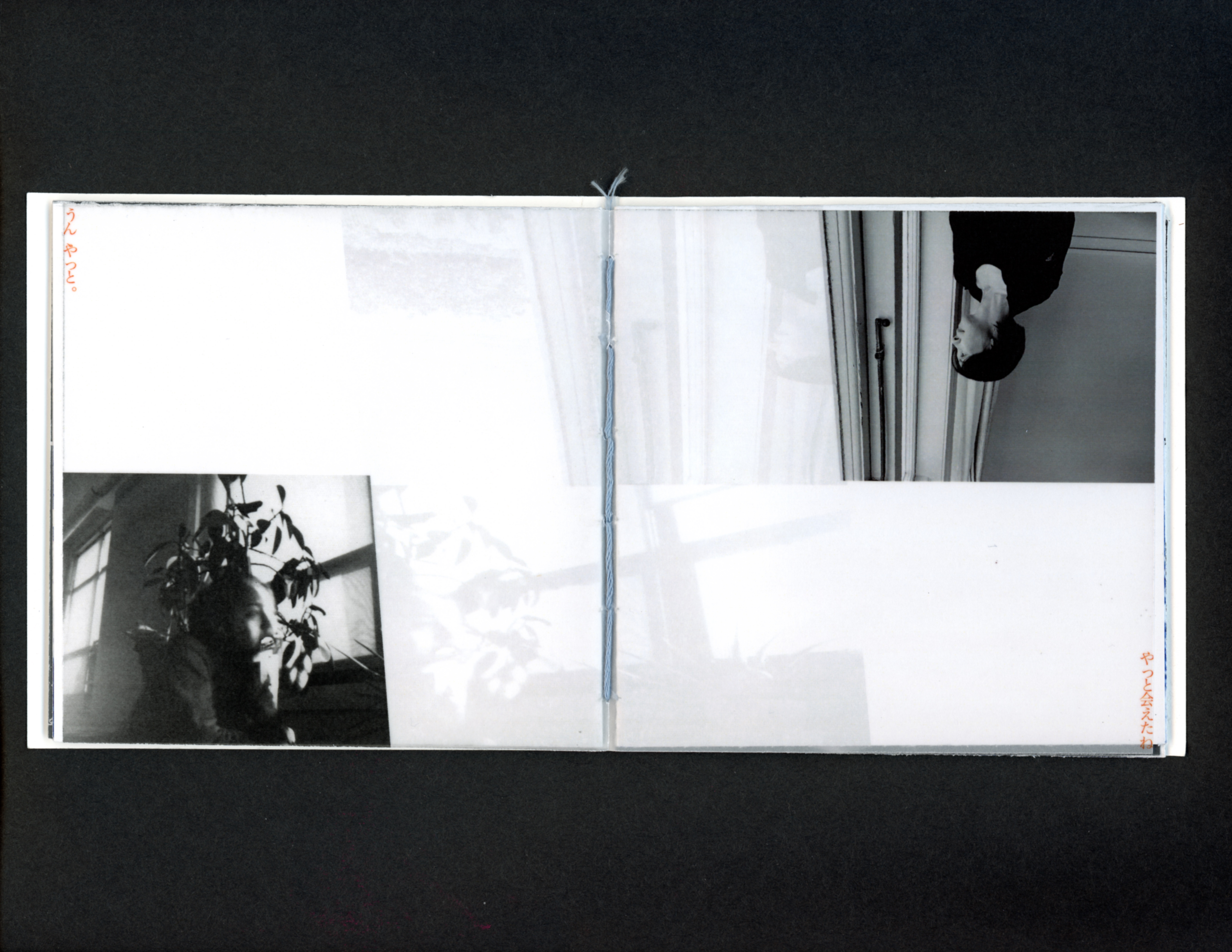
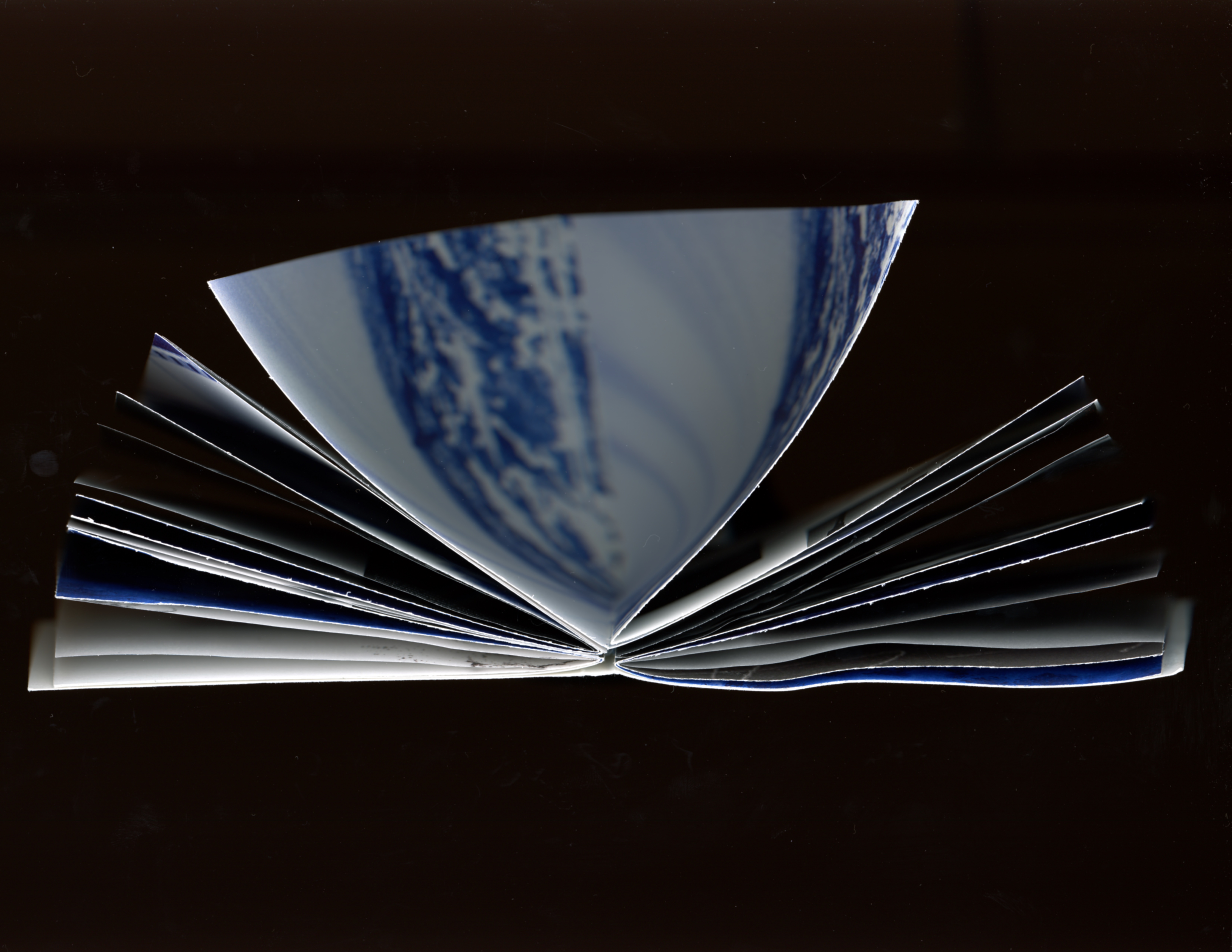
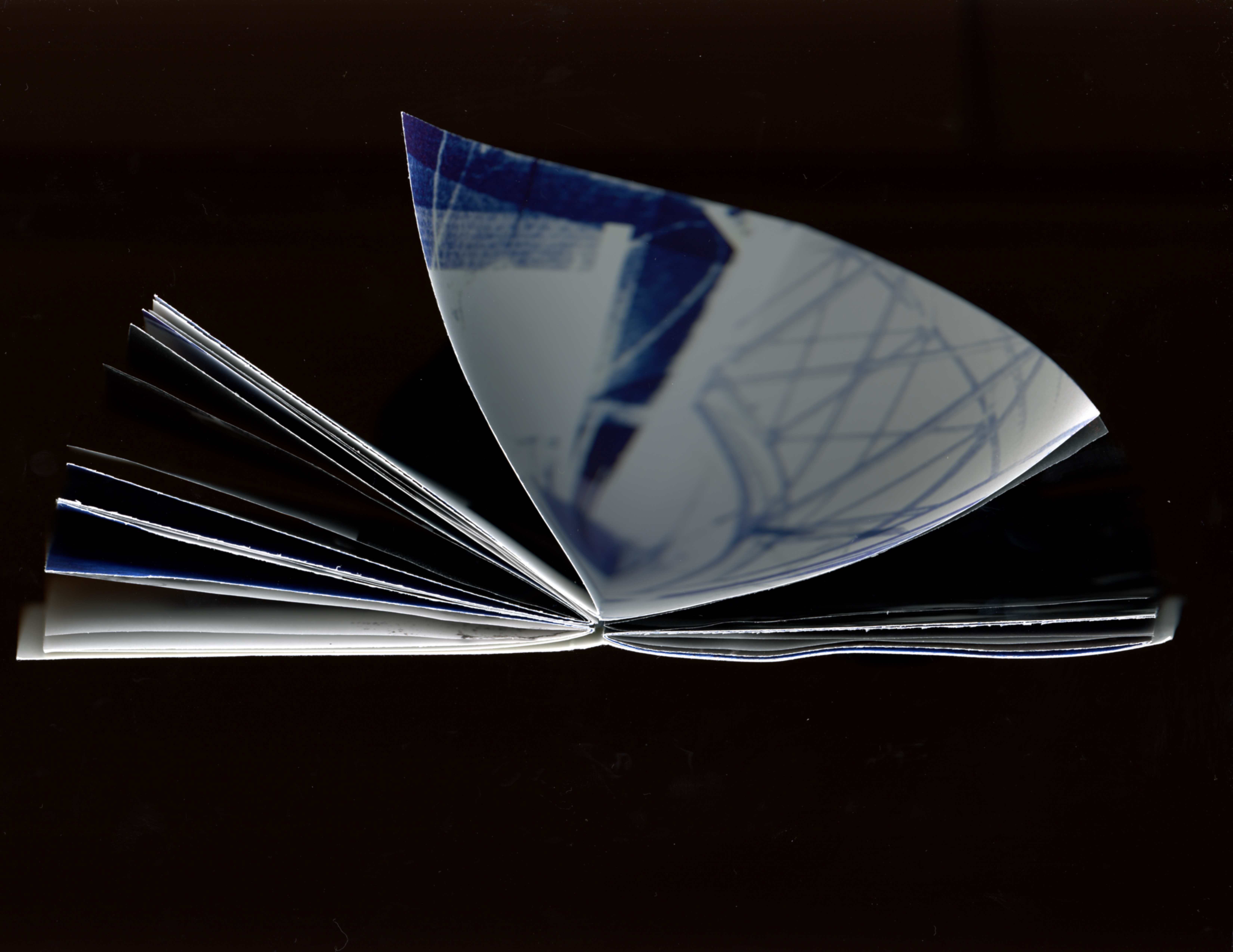
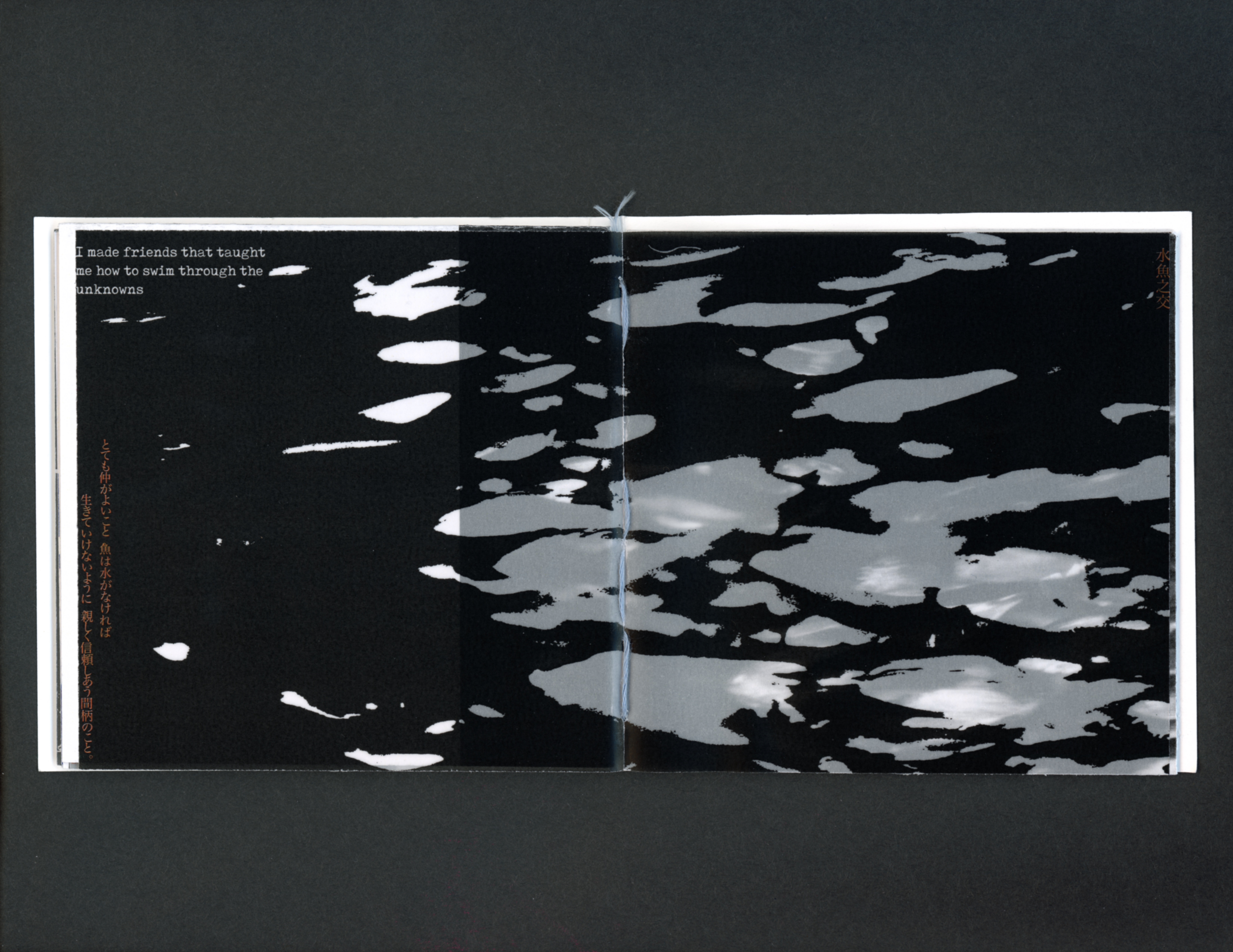
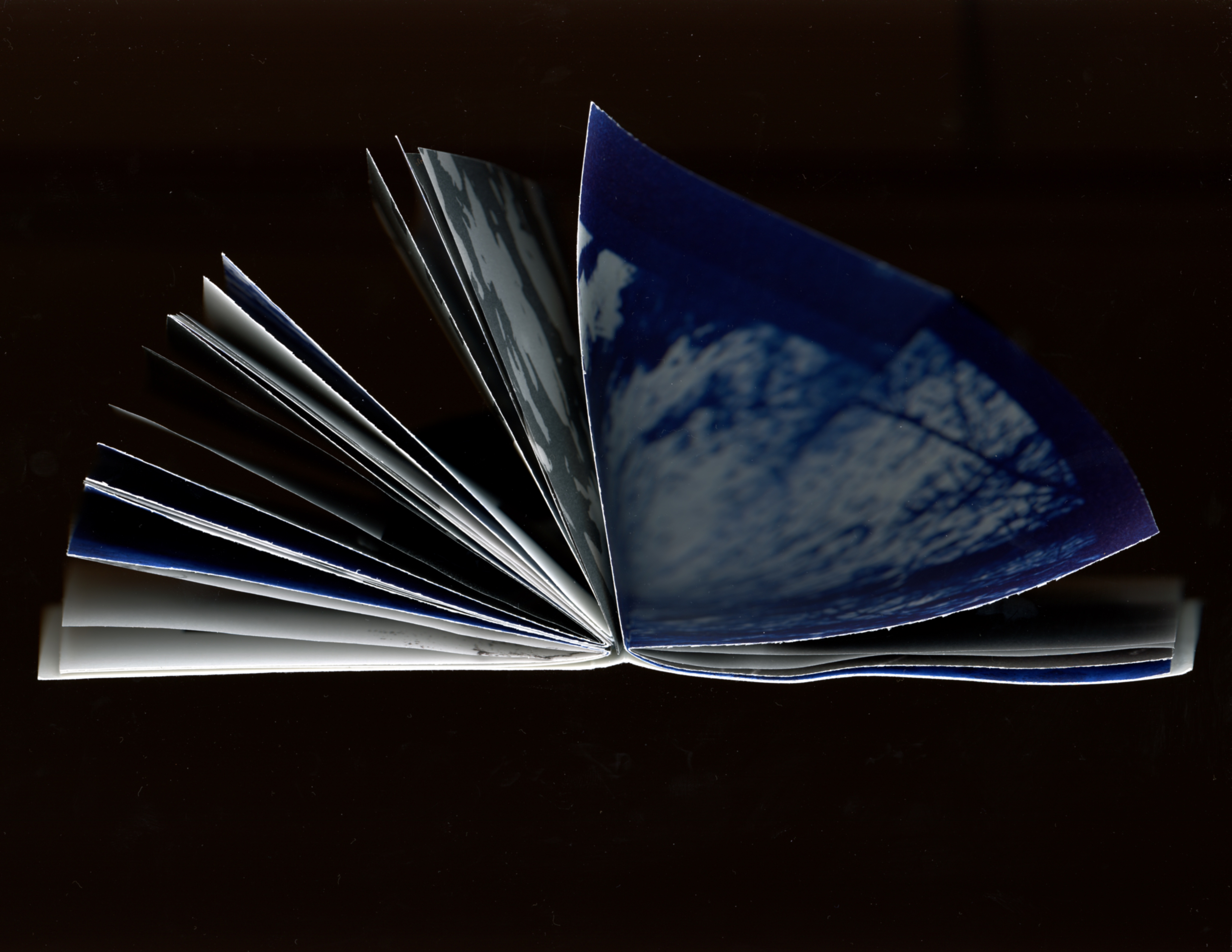
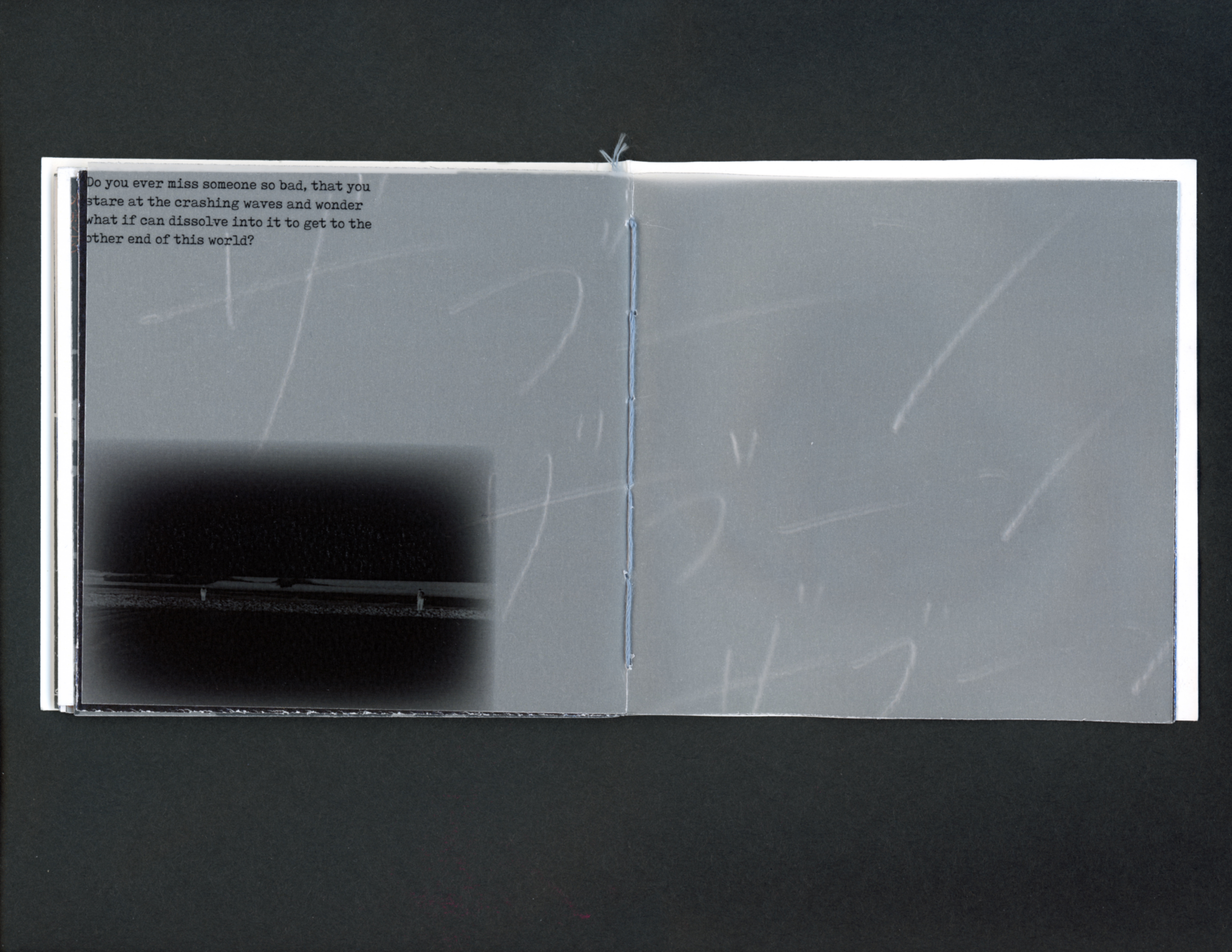
It’s about relationships between people, traveling through different spaces to reach someone while having some magical encounters with some others on the way, and missing that someone. The book travels through the air from the left side and travels through the water from the right side. And when you’re on that journey, it feels like no time has passed. Some relationships are like water and fish; fish cannot survive without water. It’s a Japanese saying that describes deep trust and people who are inseparable. The narrative is told through Japanese and English phrases written by me, along with some Japanese proverbs. It includes photos (taken by me with a pinhole camera, film camera, and digital camera), illustrations, and vellum.


Asobi Seksu Album Poster
11” x 17”
11” x 17”
January 2023
I designed the posters based on the upbeat, electronic beats of Shoegaze music, using photos I took.
The left one was designed for an album called Citrus by Asobi Seksu.
The left one was designed for an album called Asobi Seksu by Asobi Seksu.
The left one was designed for an album called Citrus by Asobi Seksu.
The left one was designed for an album called Asobi Seksu by Asobi Seksu.


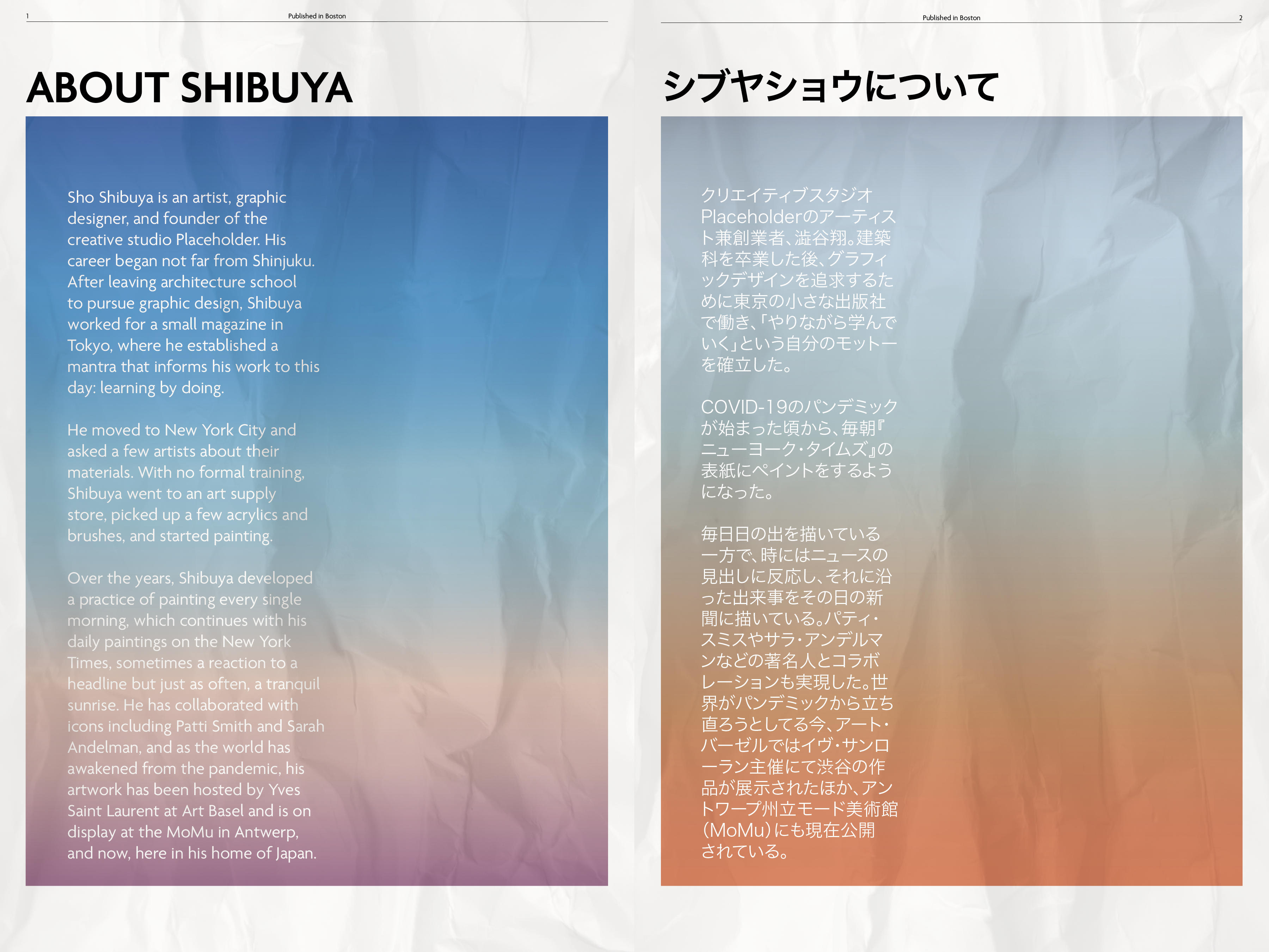
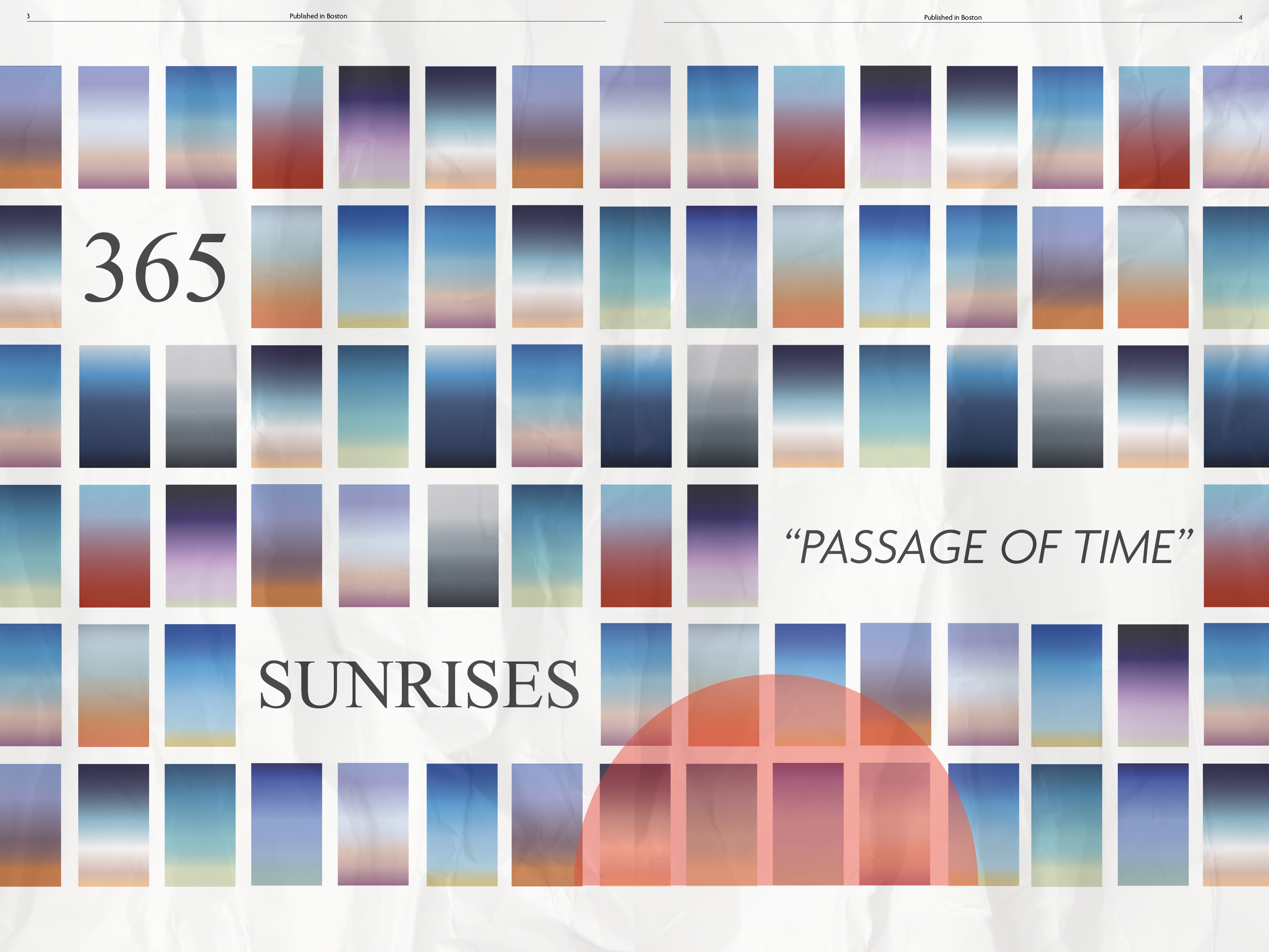
Sho Shibuya
︎Editorial Design
December 2022
︎Editorial Design
6” x 9”
December 2022
Designed spreads for Sho Shibuya and his sunrise collection


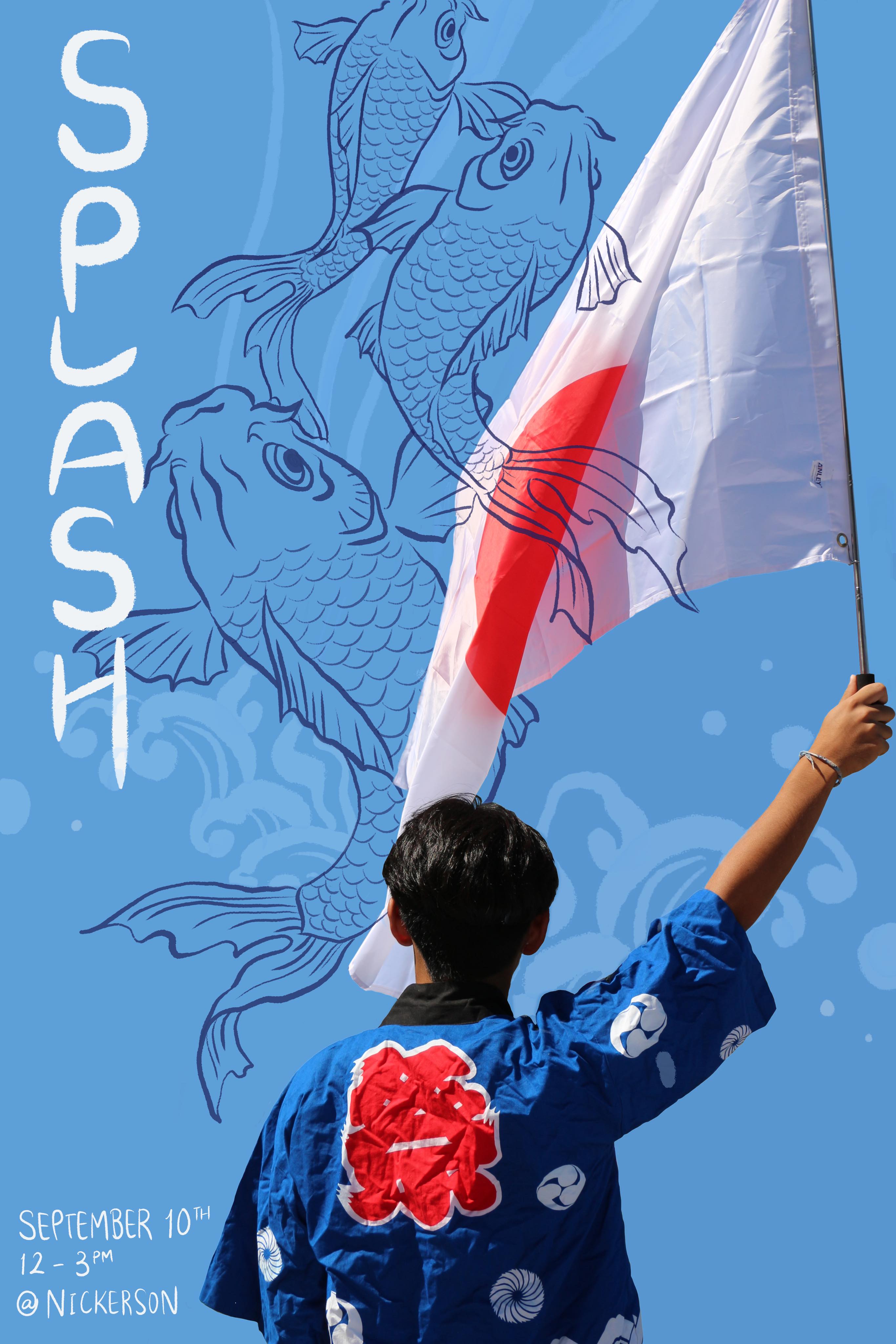
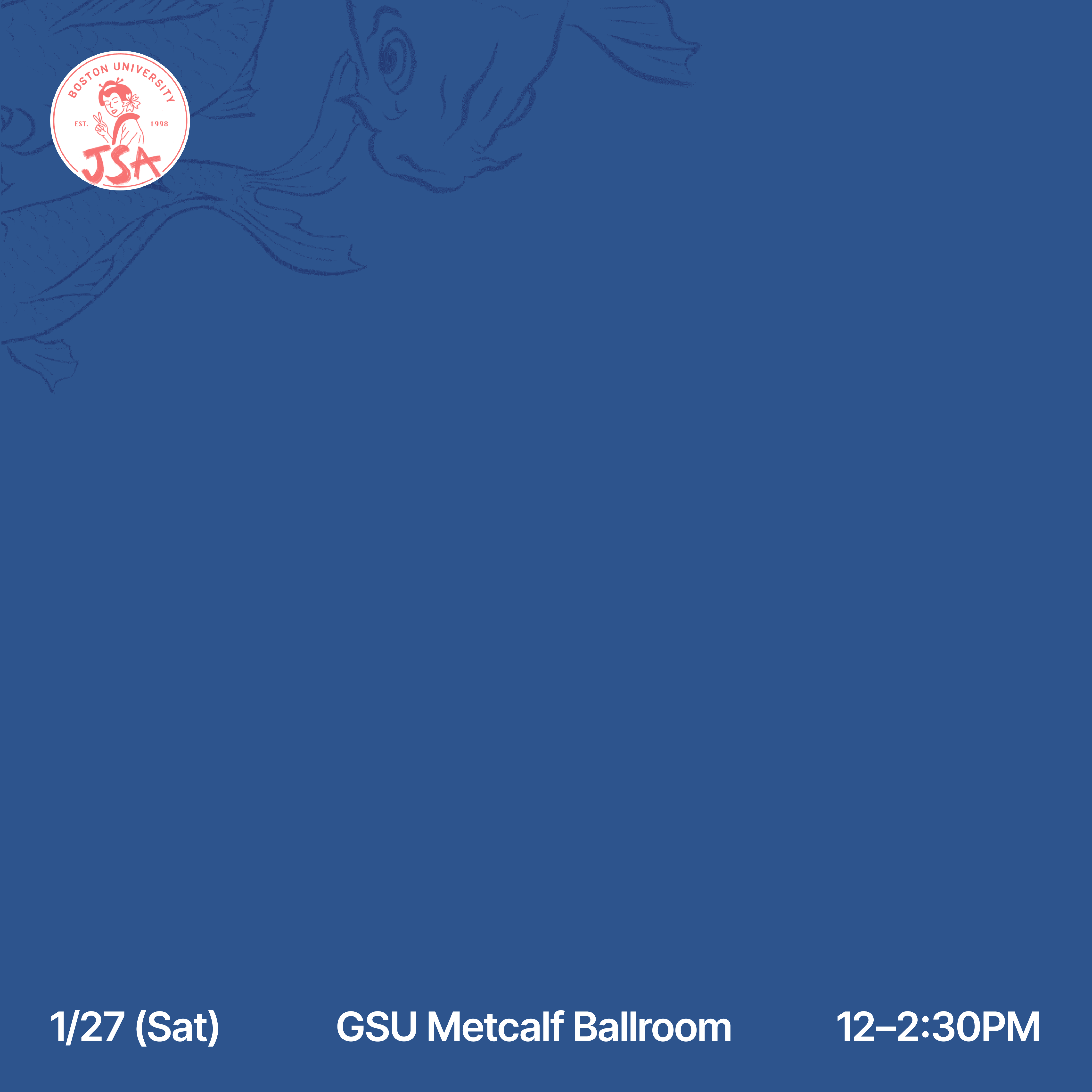
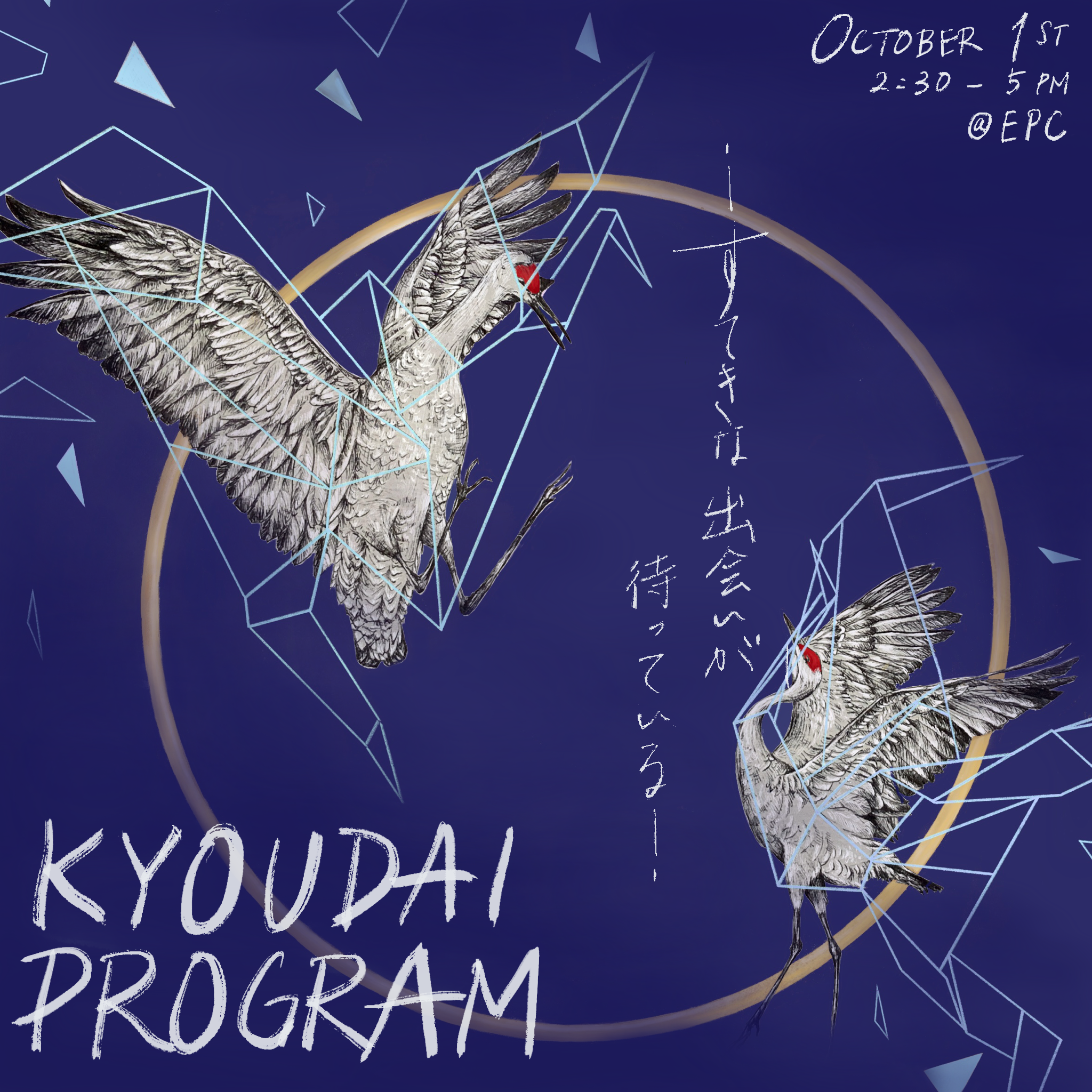
Boston University Japanese Student Association
︎Marketing, Illustration
September - December 2022
As their Marketing Manager, I made promotional posters and posts for Instagram and Facebook. These were on public digital monitors for promotional purposes as well.


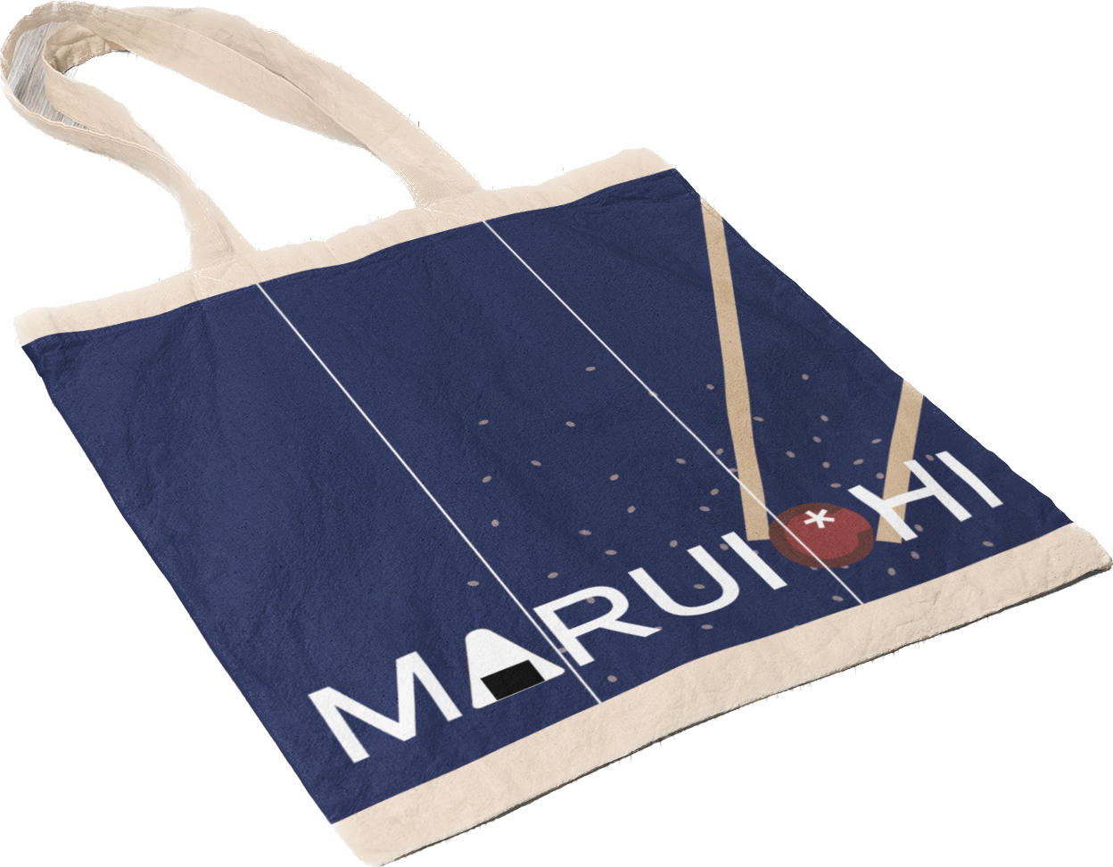
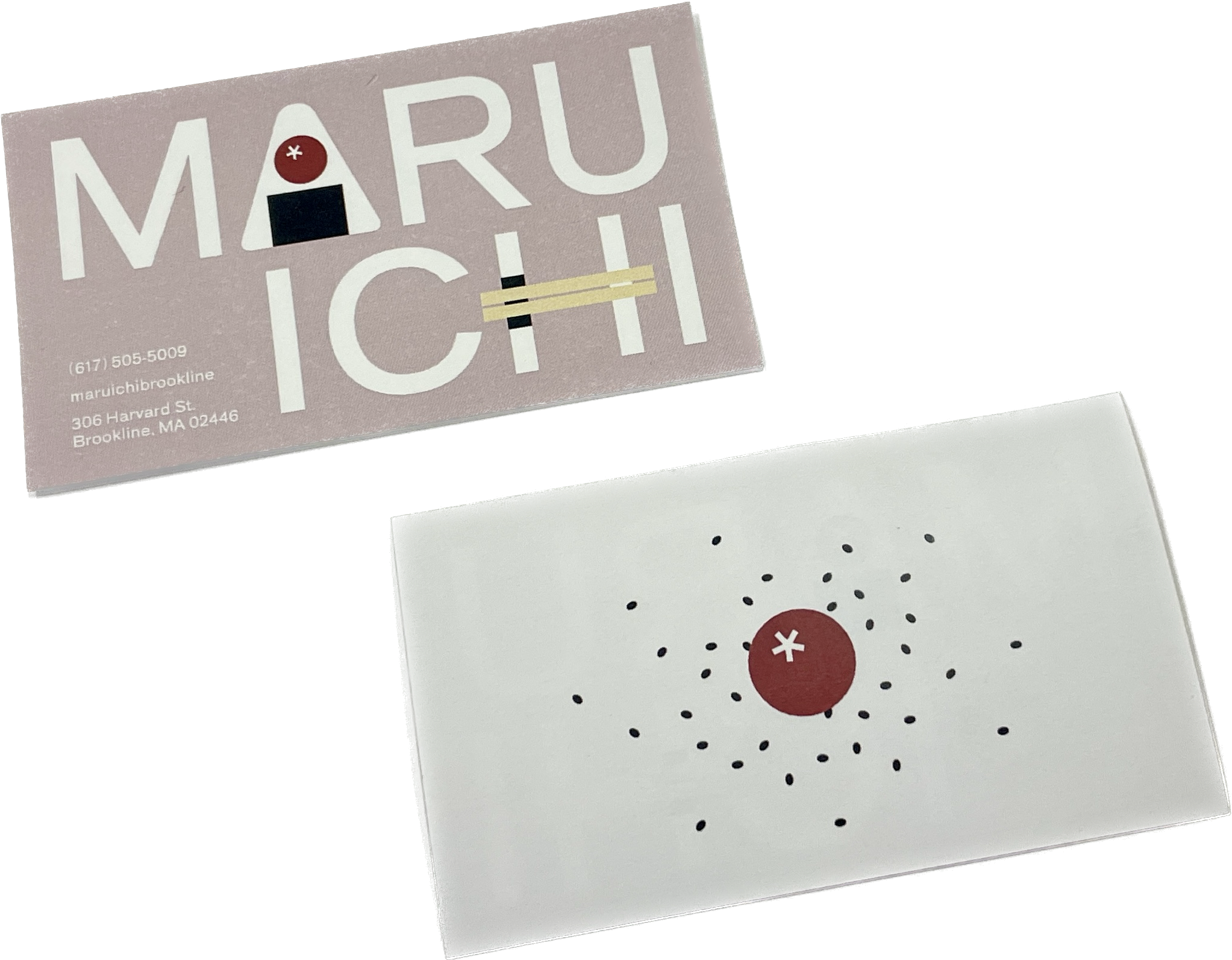
Maruichi Rebranding
︎Branding, Typography
February 2023
︎Branding, Typography
February 2023
Business card (3.5” x 2”)
Tote bag (1000px x 1000px)
Researched, ideated, and rebranded a small local business, Maruichi, which is a Japanese grocery store. After doing an interview with the manager and doing site research, I produced a type-based rebrand that elevates their brand and helps them reach larger audiences. For instance, because the business originates from a small, family run business back in Japan and the store has a family friendly atmosphere, I tried to keep the warm and welcoming tone throughout while keeping the modern look that their current logo has. Maru (circle) and ichi (one in Japanese character) are combined to create the current logo, and I continue to emphasize that with the image of plum (which is usually included in Japanese rice balls and rice in bento boxes that are also sold at Maruichi) and horizontal chopsticks. I also brought in the store’s physical design by including the noren curtains in the tote bag design.